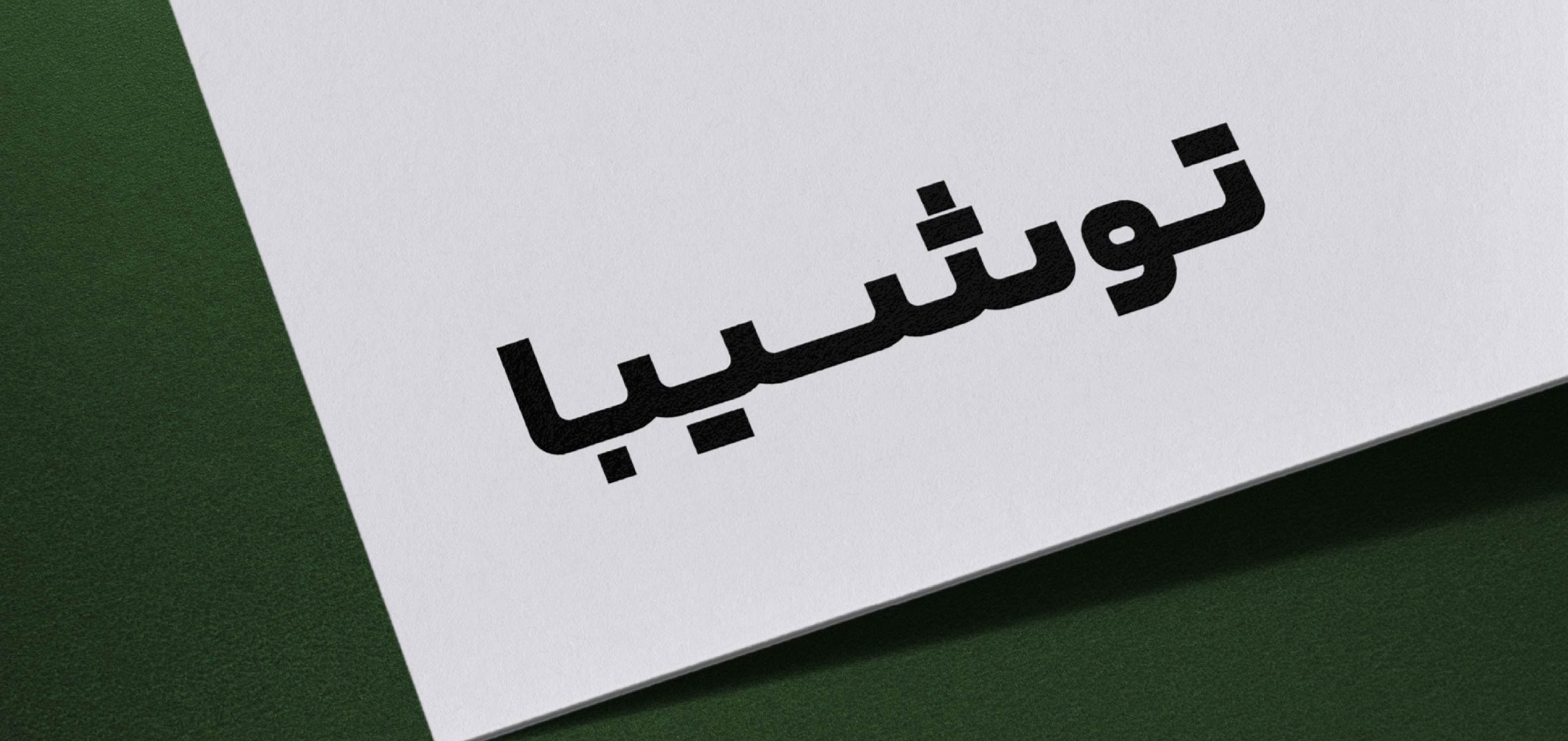

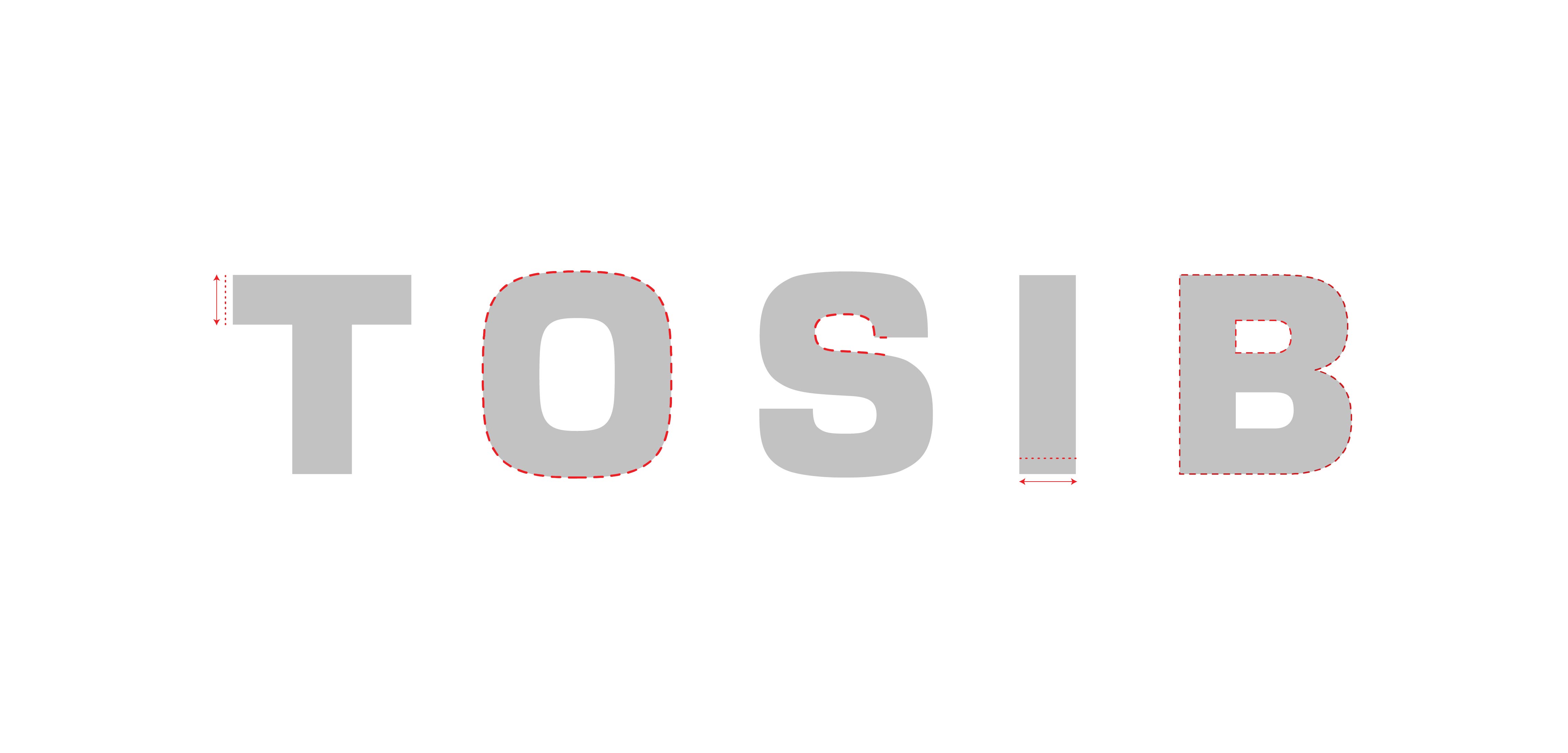
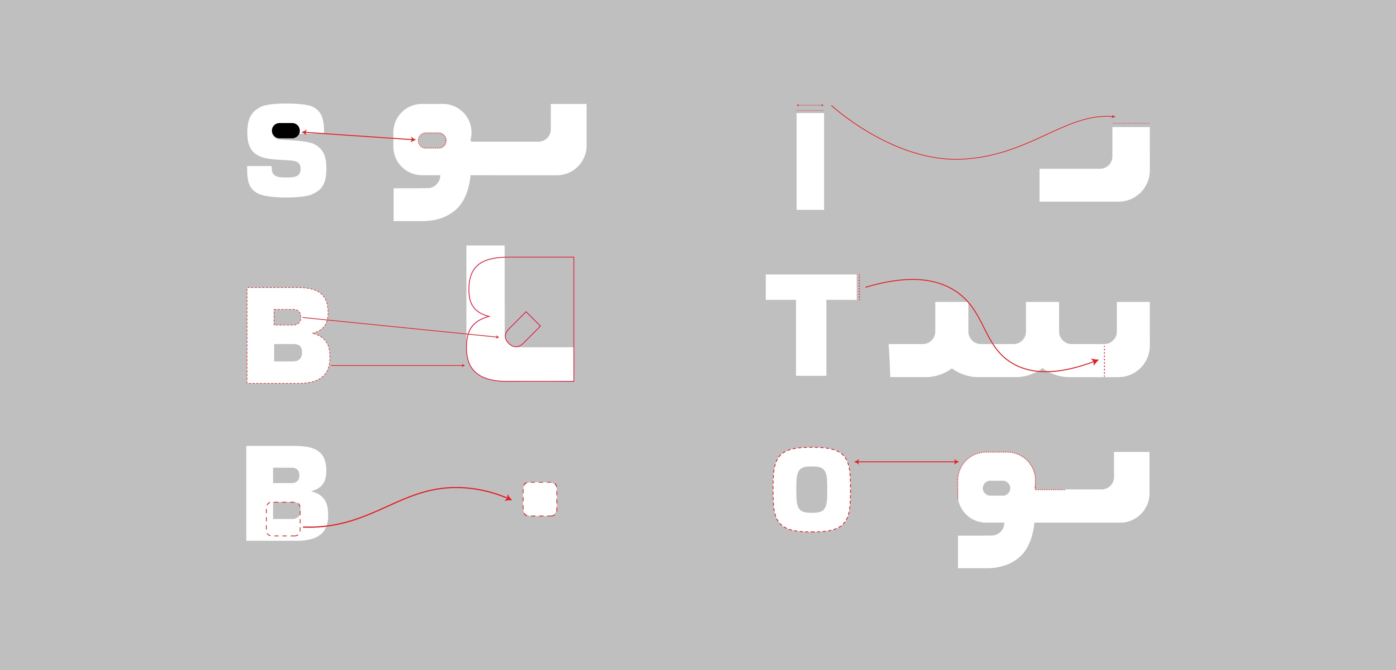
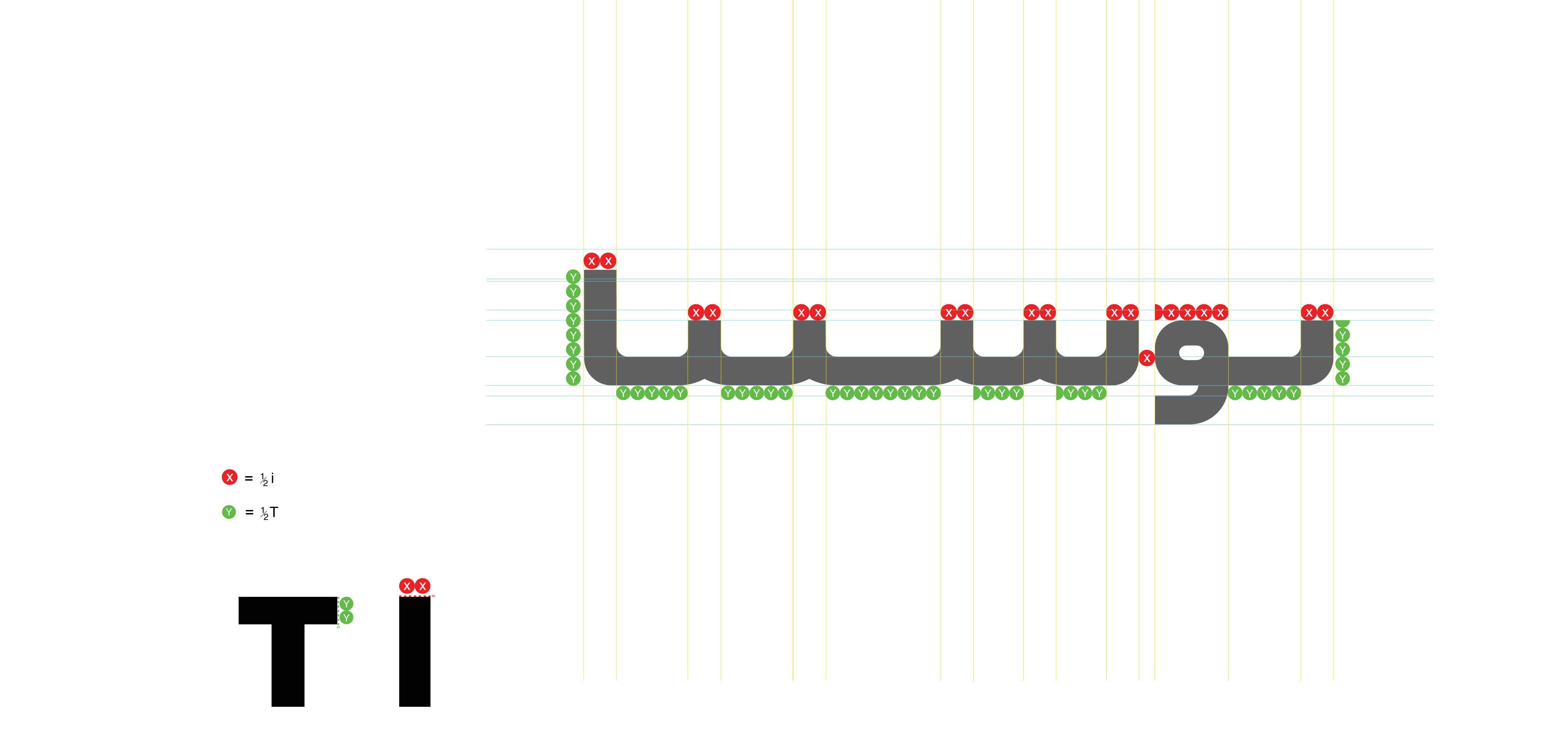
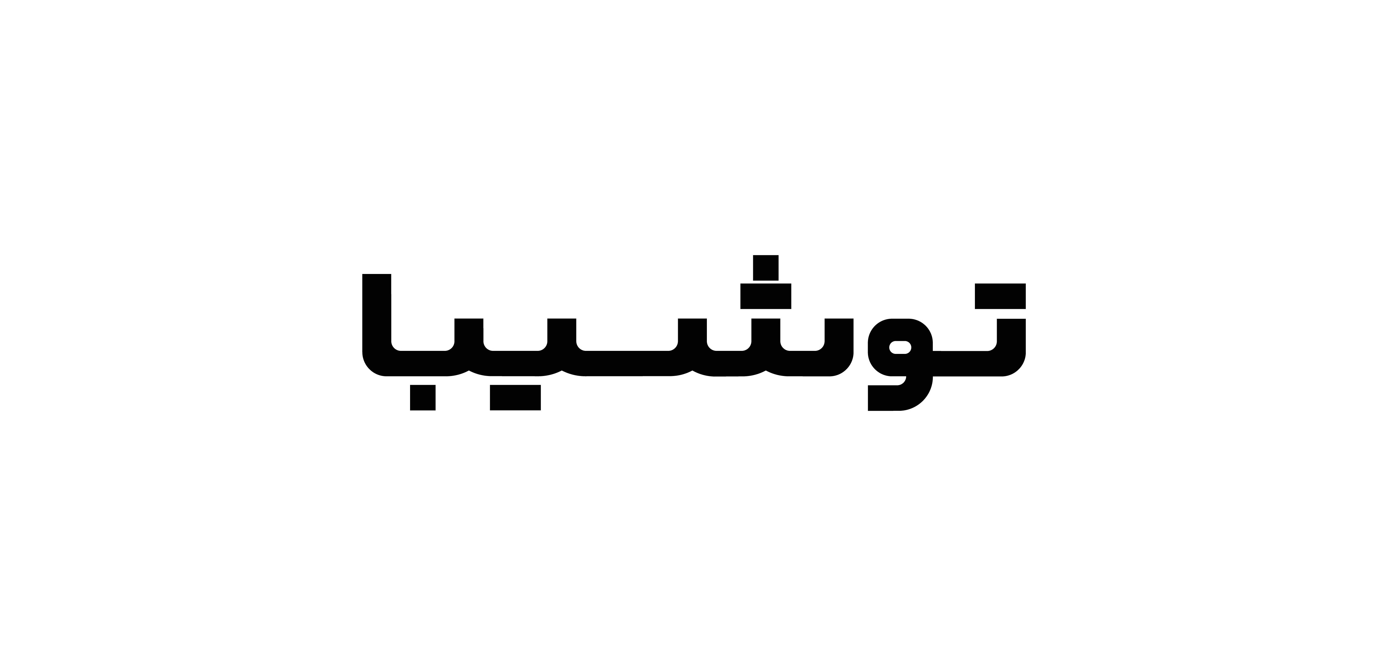
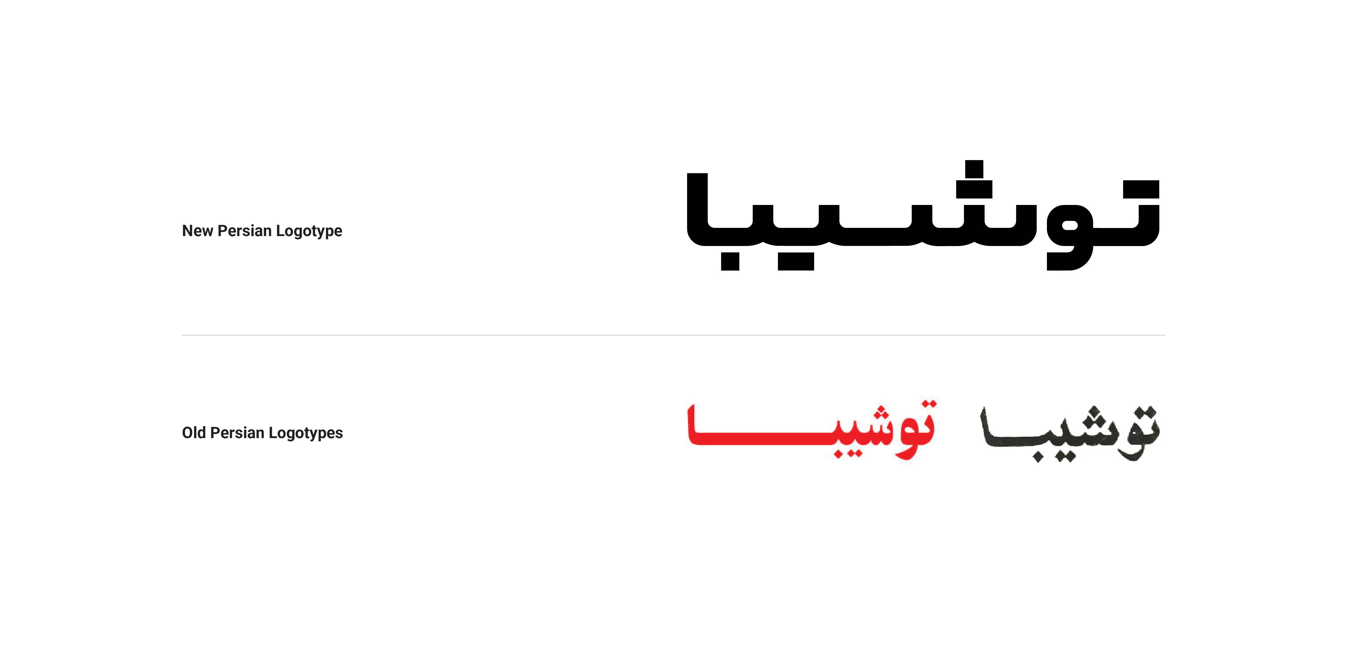
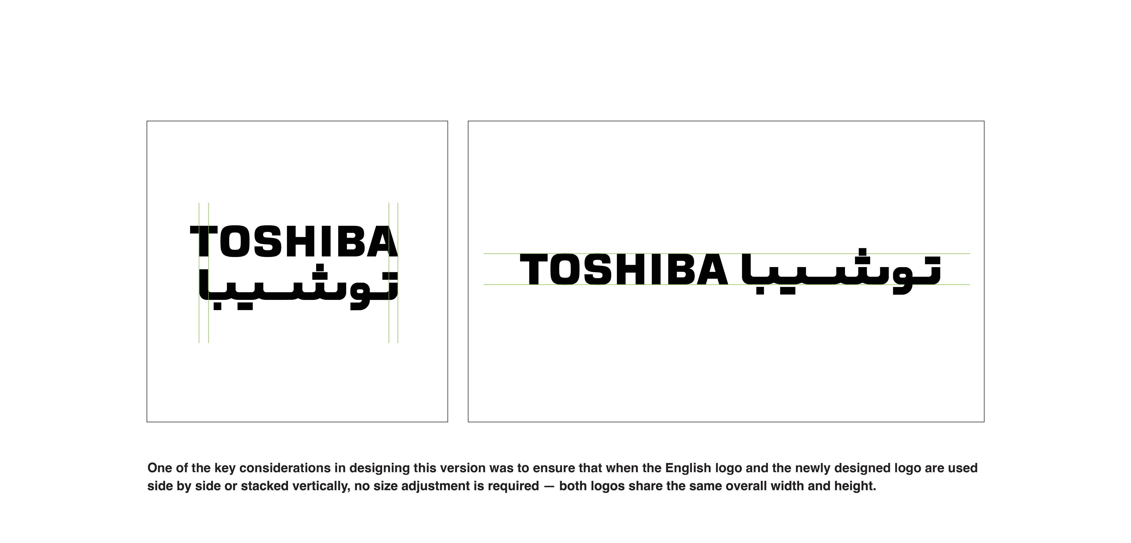
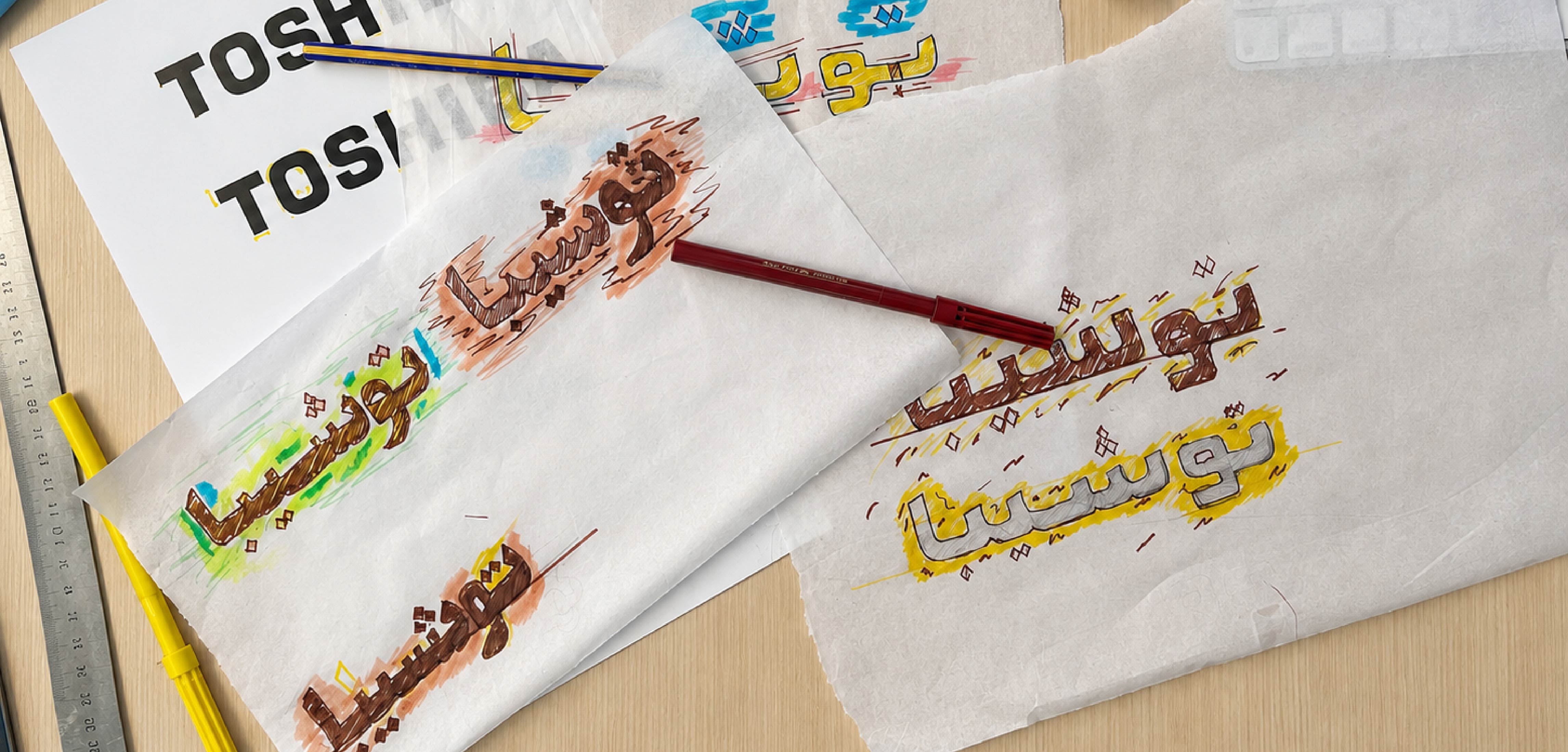
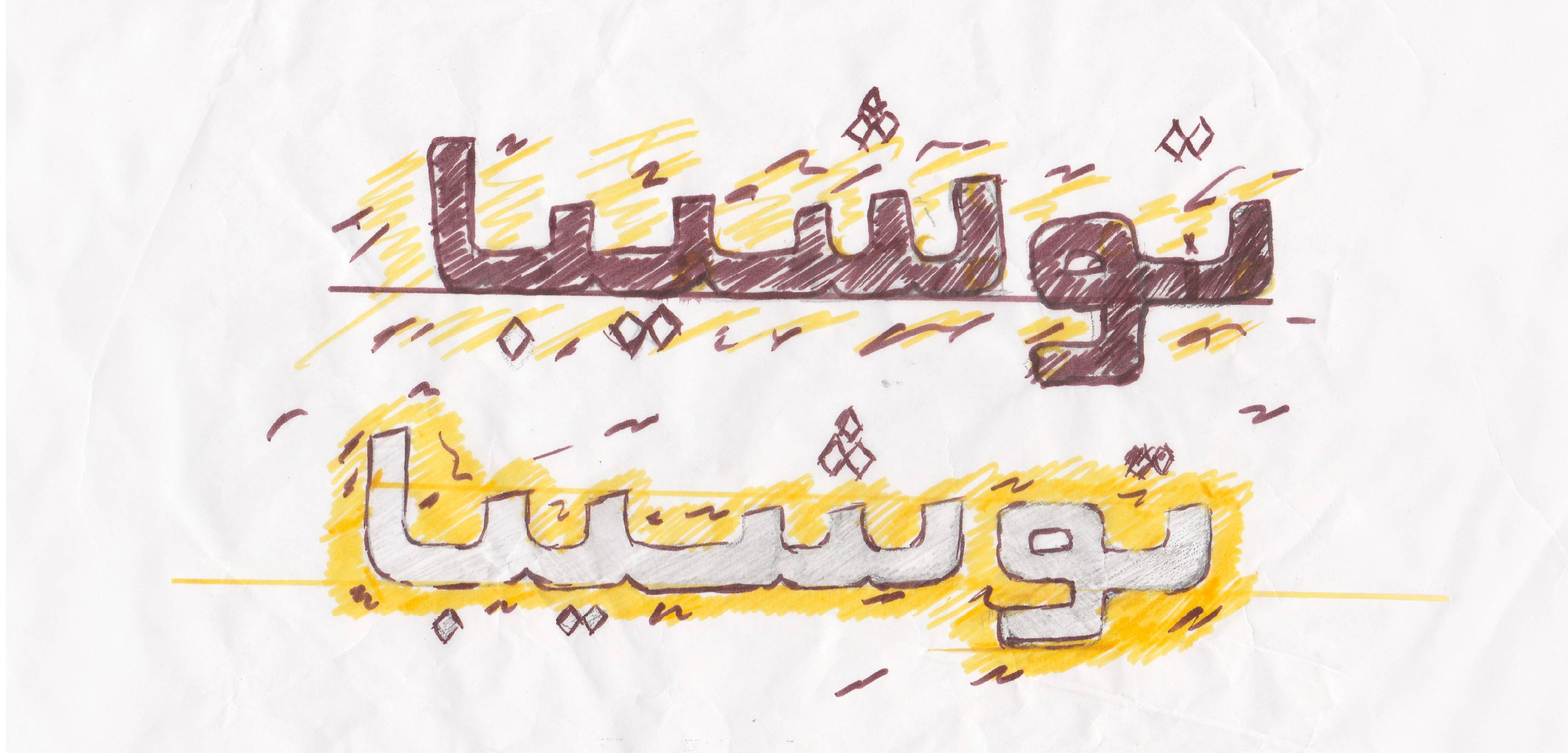
Previous Arabic/Persian versions of the Toshiba logo lacked a consistent structure and visual relationship with the English logo. The redesign aimed to create a unified identity system across Persian and Arabic communications. Initial explorations revisited existing Persian forms to retain elements of the brand’s visual memory. why Did the persian Toshiba Logotype Need to Be Redesignerd? A review of the Persian versions of the Toshiba logo that had been used in Iran over the years revealed that they did not follow a consistent structure or defined set of guidelines. When placed alongside the English logo, they also lacked sufficient visual coherence. In some cases, the Persian and English versions appeared less like parts of a unified identity system and more like two independent forms. During the development of the new Persian logotype, the previous versions were also studied. Since these forms were already familiar to Iranian audiences, some of the initial explorations were based on revisiting and refining the existing logotypes. This approach offered an opportunity to preserve part of the visual memory that had developed around the brand. However, it became clear that this solution still could not establish a strong enough connection between the Persian and English versions. At the same time, the new logotype needed to work alongside the English version across a wide range of applications and scales—from environmental communications and advertising to digital media and printed materials. For this reason, the design process did not focus solely on achieving a visual resemblance between the two versions. Proportions, visual weight, and the reproducibility of the Persian logotype were also carefully considered throughout the process. The design process began with hand-drawn explorations, with the aim of developing a form that could preserve the readability and visual characteristics of the Persian script while establishing a clear relationship with the visual language of the Toshiba English logo. Throughout this process, the English logo served as the primary visual reference. Characteristics such as letter weight, geometric proportions, curves, and the treatment of dots were carefully studied and translated into the Persian form, creating a visual and structural relationship between the two languages. The result is a Persian logotype that, when placed alongside the English version, functions not as a separate form but as part of a unified identity system—allowing the brand to communicate consistently across both languages without compromising its core visual identity. The redesign of the Persian Toshiba logotype was an attempt to establish a meaningful connection between two languages while preserving the brand’s identity and essential visual characteristics. Logotype Design
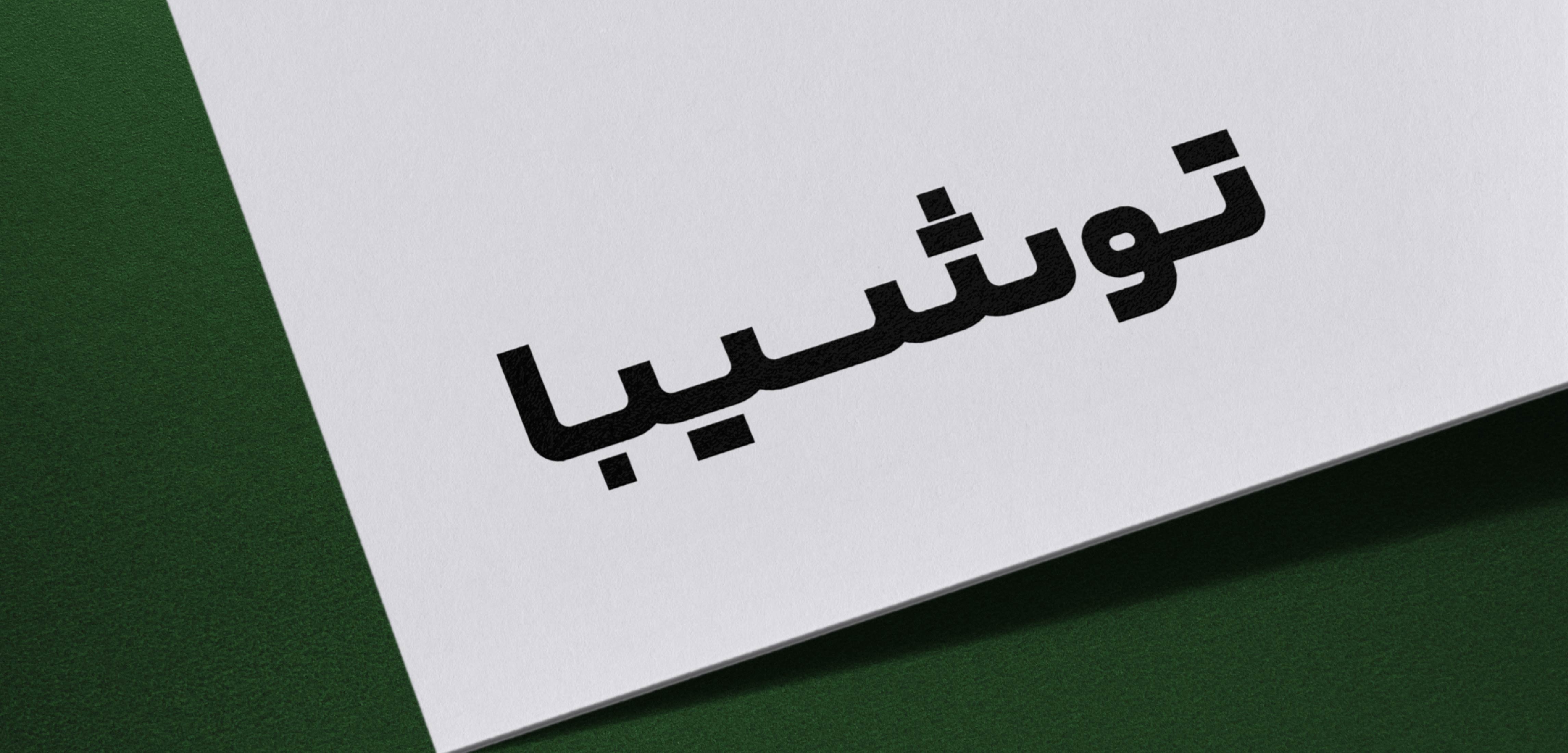
Toshiba Arabic Logotype
The final direction was developed through hand-drawn studies, using the English logo as the primary visual reference. Its proportions, weight, curves, and geometric characteristics informed the Persian and Arabic letterforms. The result is a multilingual logotype designed to maintain consistency across languages, applications, and scales.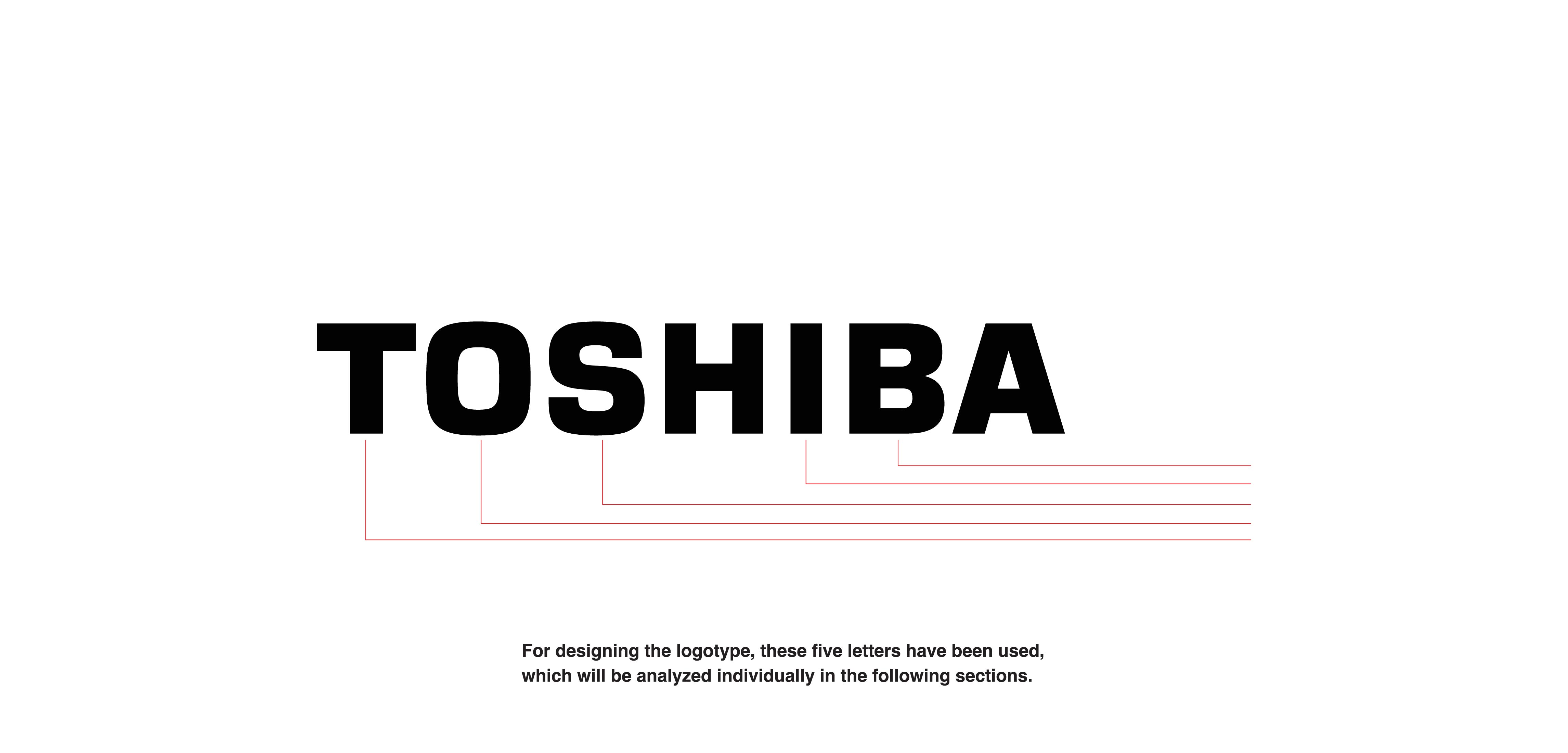


This website uses cookies to improve your web experience.