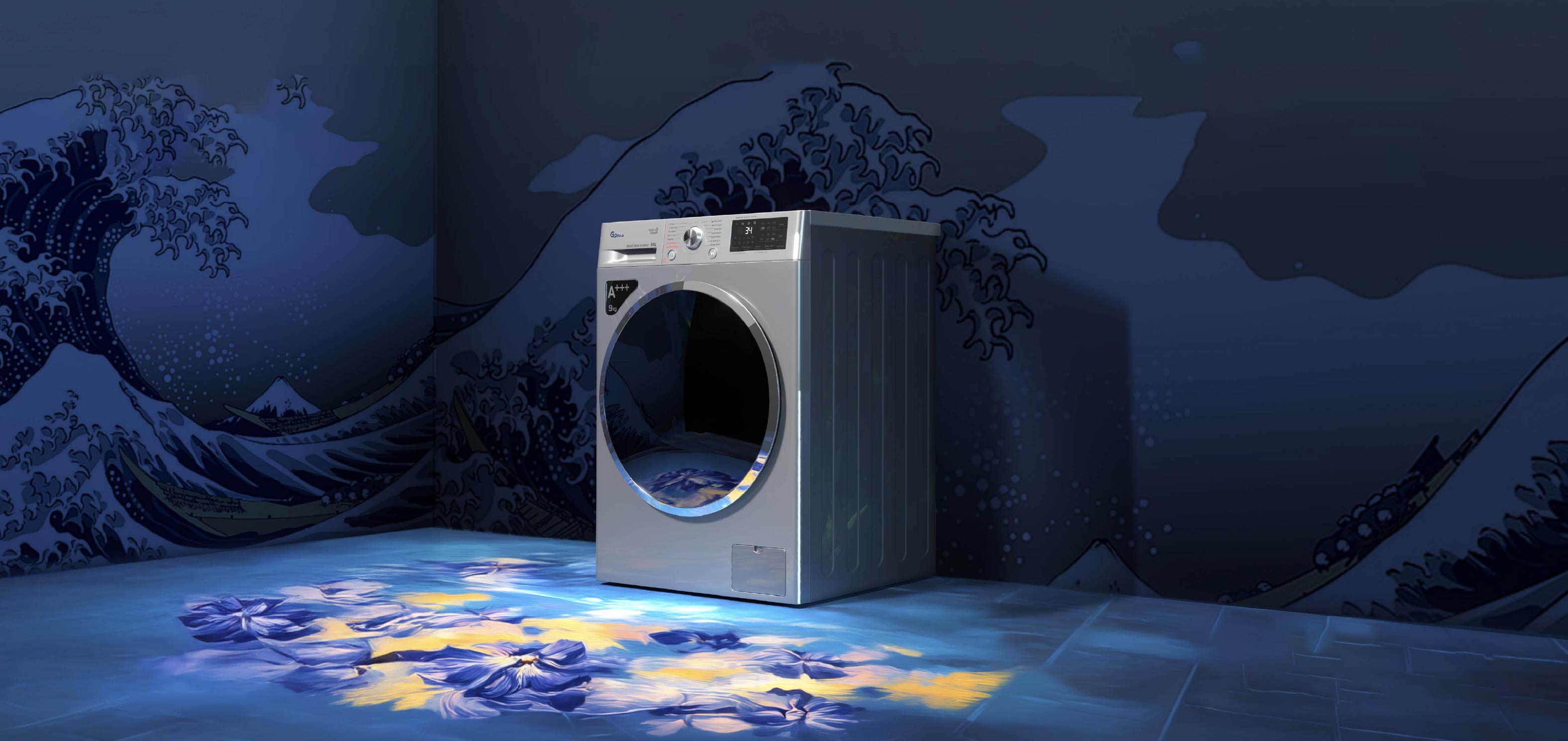
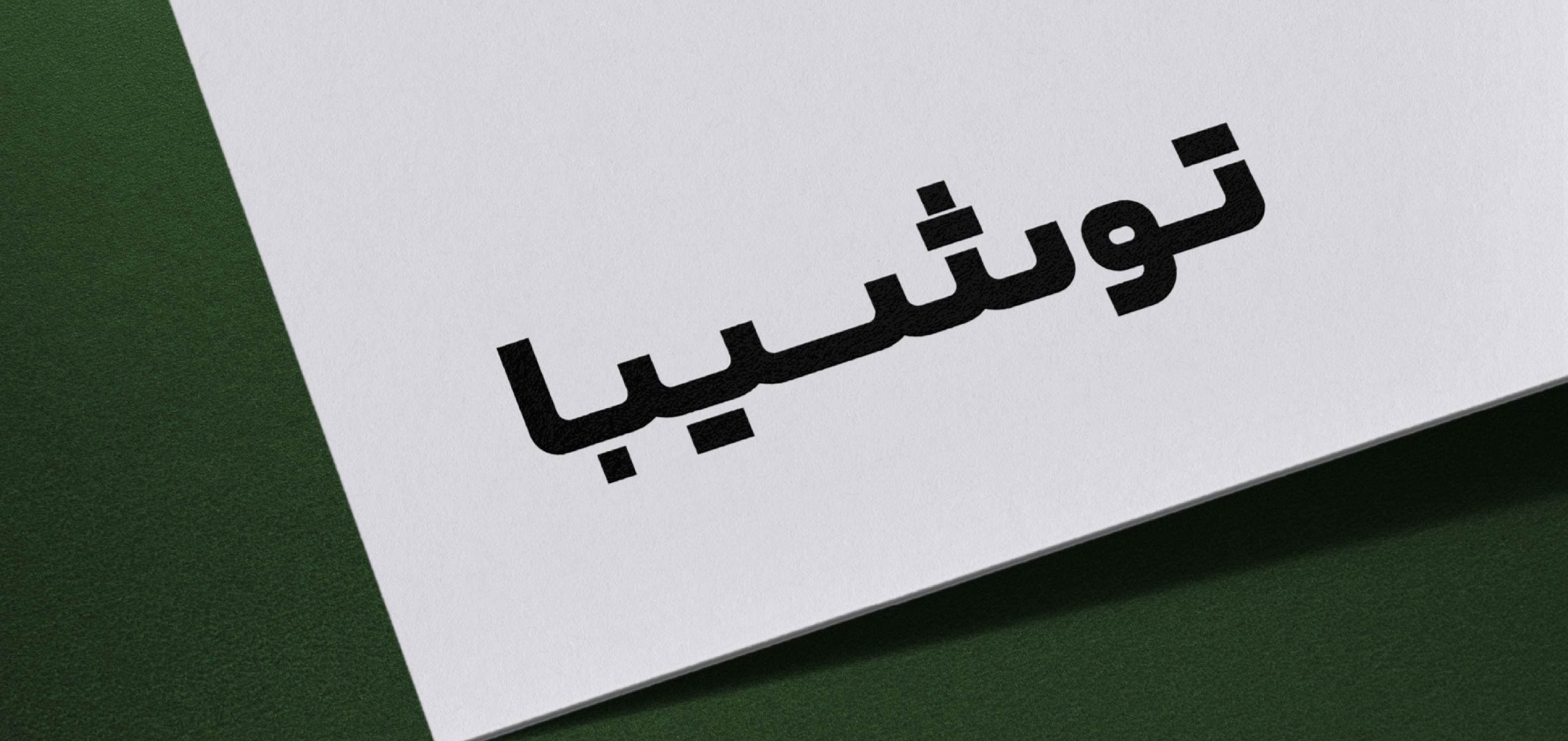

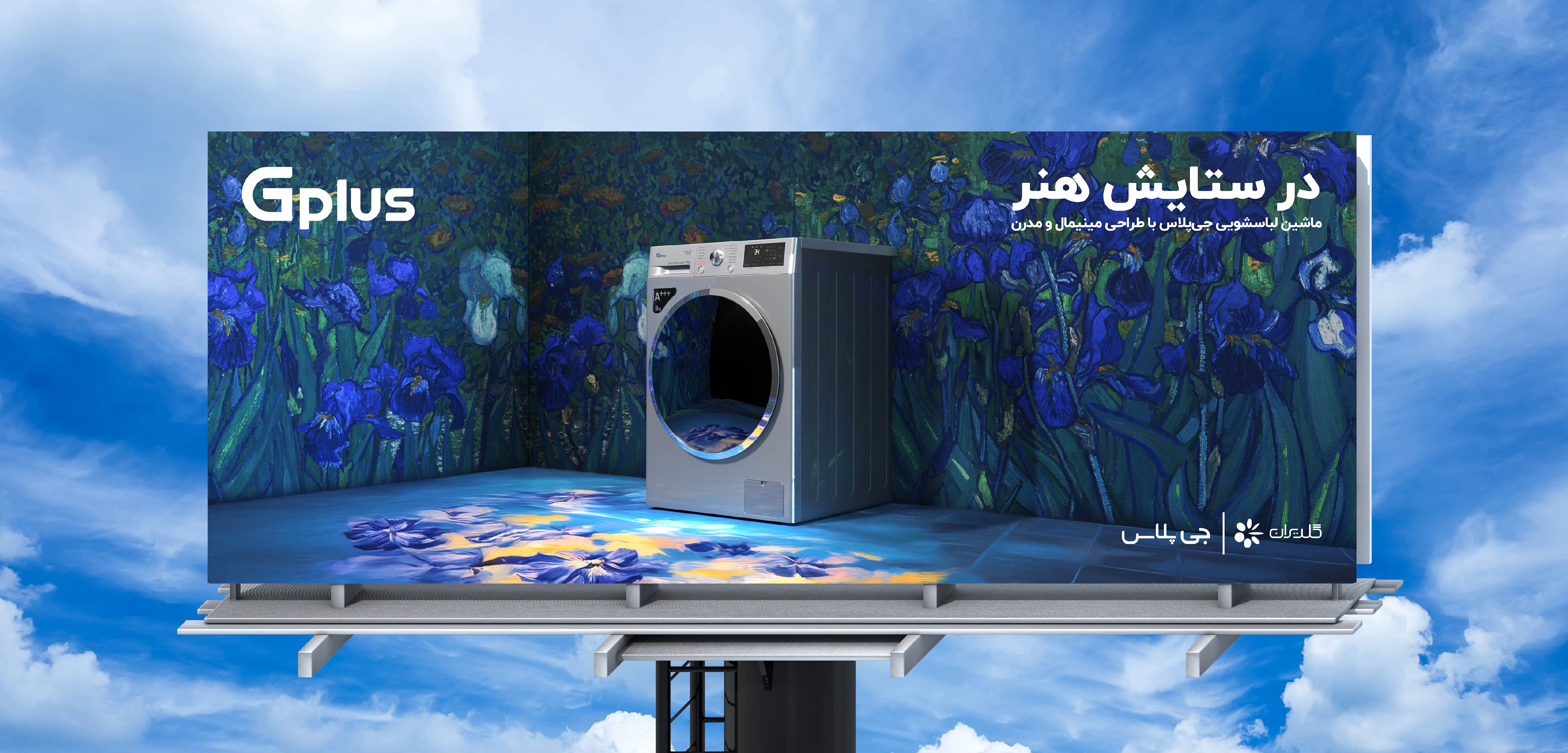
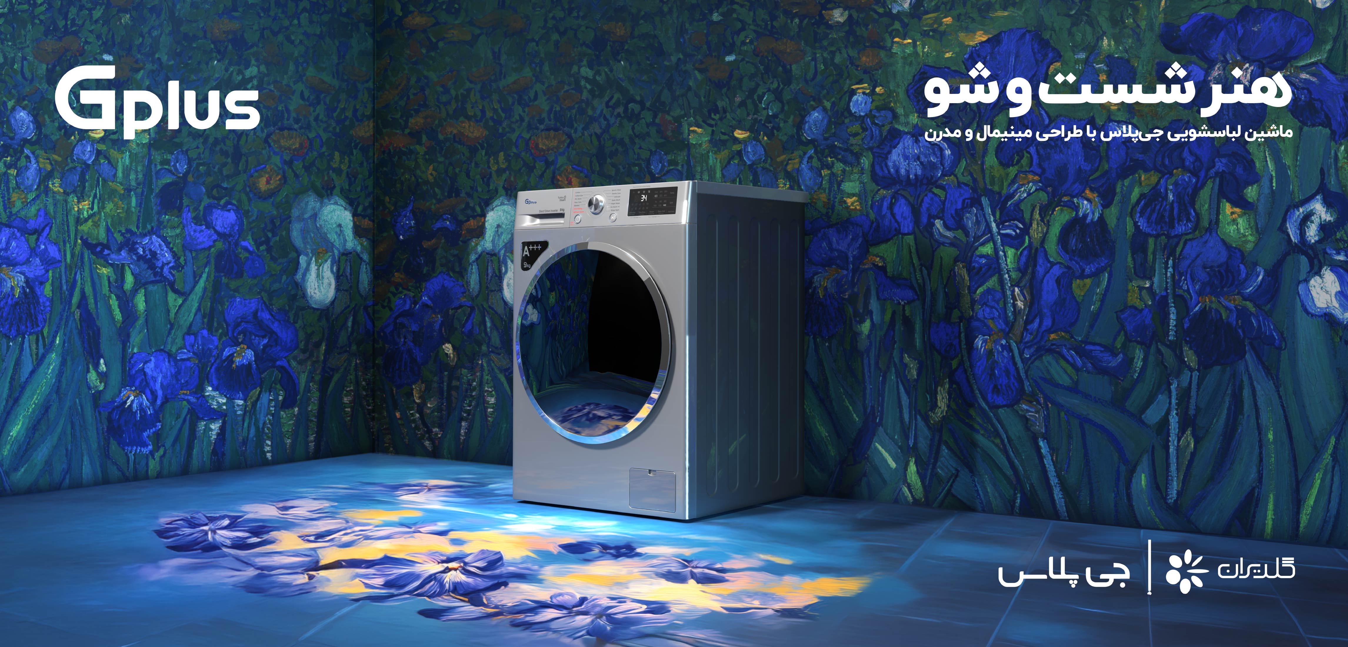
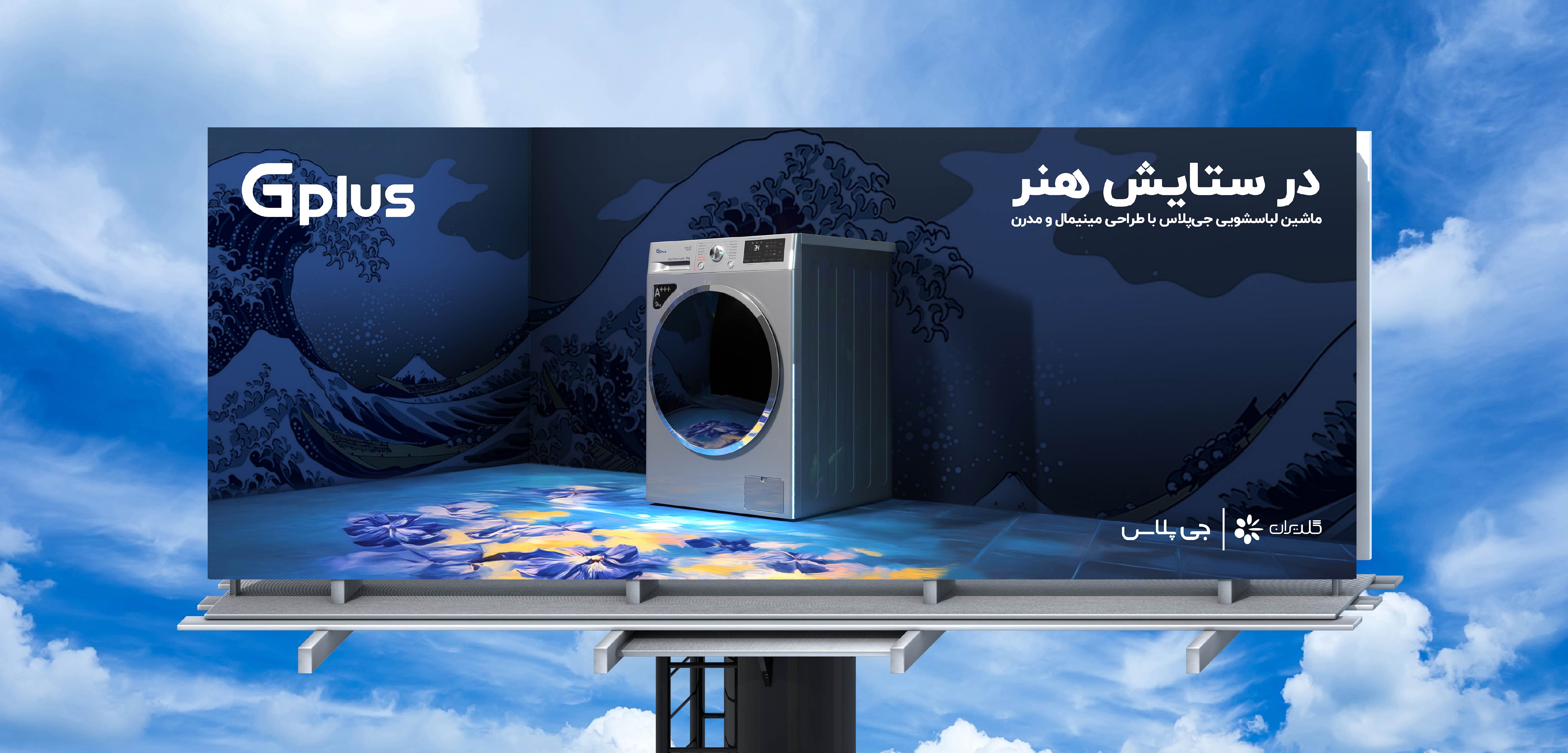
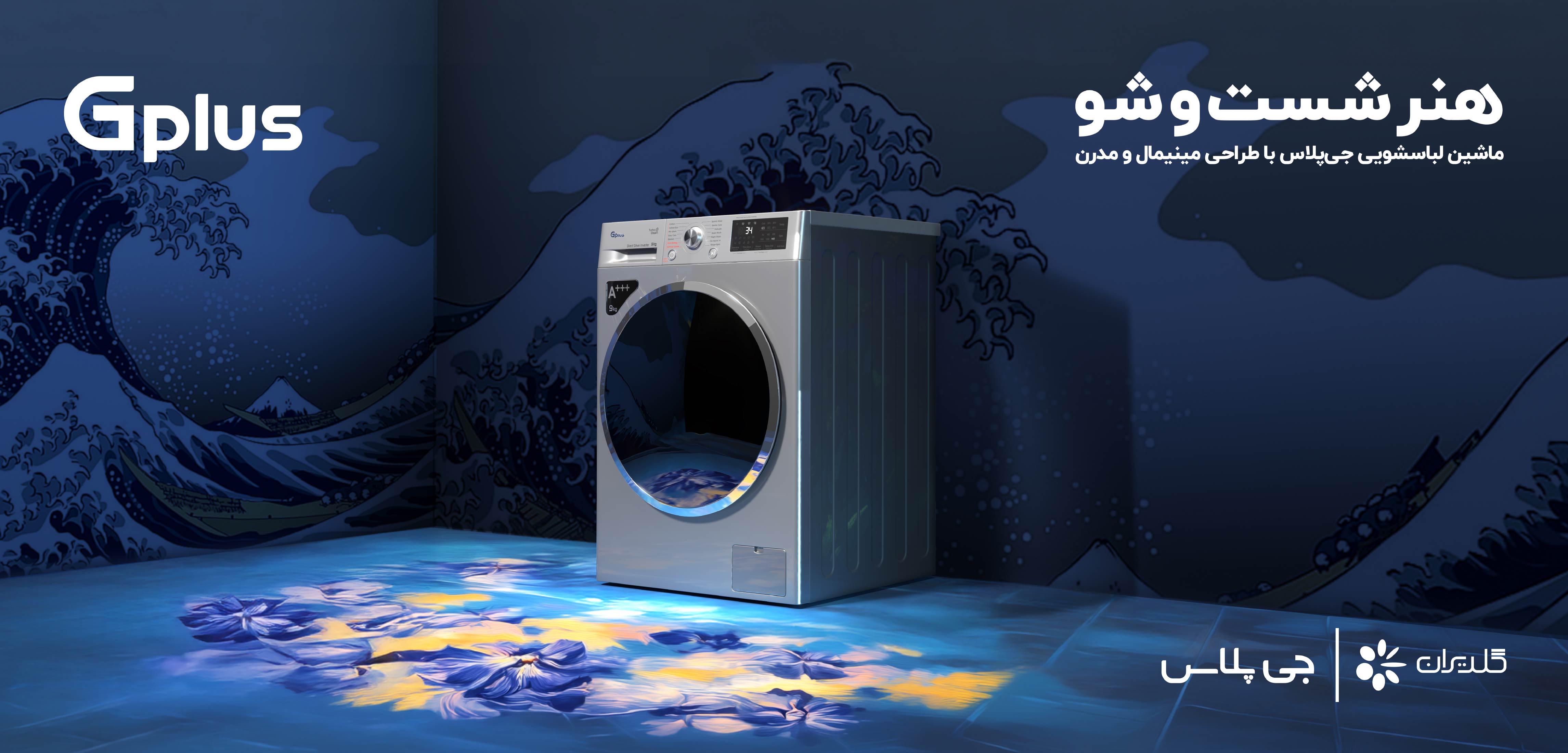
For the launch of Gplus’s new washing machines and the introduction of several new features, we wanted to move away from the usual visual language of home appliance advertising. Instead, we looked for an idea that could go beyond a product launch and create a more memorable visual identity for the campaign. After exploring different directions, we arrived at “The Art of Washing” — an idea that transformed the washing machine from a household appliance into part of an artistic world. For the visual execution, we placed the washing machine at the center of each scene, surrounded by interiors covered with iconic artworks — from The Great Wave off Kanagawa by Hokusai to works by Van Gogh and other artists. This structure allowed us to expand the concept across a wide range of artworks and styles, turning each visual into part of a larger collection. “The Art of Washing” was an attempt to give a product campaign its own visual language, moving beyond the familiar conventions of home appliance advertising. why Did the persian Toshiba Logotype Need to Be Redesignerd? A review of the Persian versions of the Toshiba logo that had been used in Iran over the years revealed that they did not follow a consistent structure or defined set of guidelines. When placed alongside the English logo, they also lacked sufficient visual coherence. In some cases, the Persian and English versions appeared less like parts of a unified identity system and more like two independent forms. During the development of the new Persian logotype, the previous versions were also studied. Since these forms were already familiar to Iranian audiences, some of the initial explorations were based on revisiting and refining the existing logotypes. This approach offered an opportunity to preserve part of the visual memory that had developed around the brand. However, it became clear that this solution still could not establish a strong enough connection between the Persian and English versions. At the same time, the new logotype needed to work alongside the English version across a wide range of applications and scales—from environmental communications and advertising to digital media and printed materials. For this reason, the design process did not focus solely on achieving a visual resemblance between the two versions. Proportions, visual weight, and the reproducibility of the Persian logotype were also carefully considered throughout the process. Creative & Visual Design
Gplus Washing Machine Launch
Gplus — The Art of Washing


This website uses cookies to improve your web experience.