



When I was commissioned to develop the cover design system for Ayra Publication, several concepts had already been explored by another designer, but none had reached the desired outcome. In the first meeting, I reviewed the feedback and reasons behind the rejected concepts to understand the publisher’s expectations and visual preferences, and began developing the design accordingly. After around three rounds of feedback and refinement, we arrived at a system built around a consistent visual structure combined with flexible imagery and layouts. The goal was to establish a recognizable and memorable visual identity for Ayra as a newly established publisher, while allowing its different categories to develop their own visual language. The system was initially designed for a first phase of approximately 15 books over one year, with the intention of further developing and refining it as the publisher’s identity evolved. Cover Design Guidelines — Ayra Publication 01 — Shared Visual Foundation 02 — Category-Based Visual Language 03 — Image Direction 04 — Flexible Layout System Art Direction
Ayra Publication

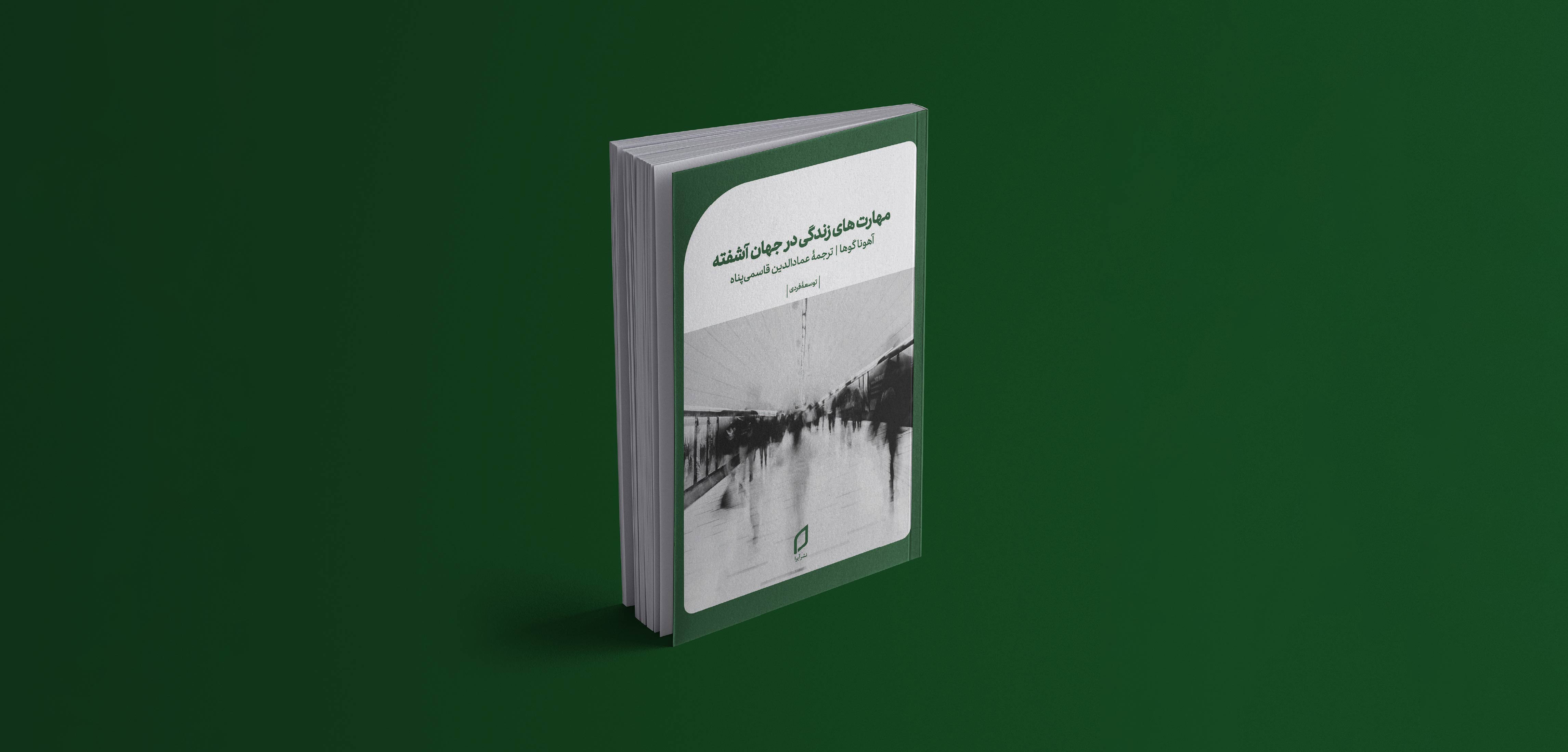
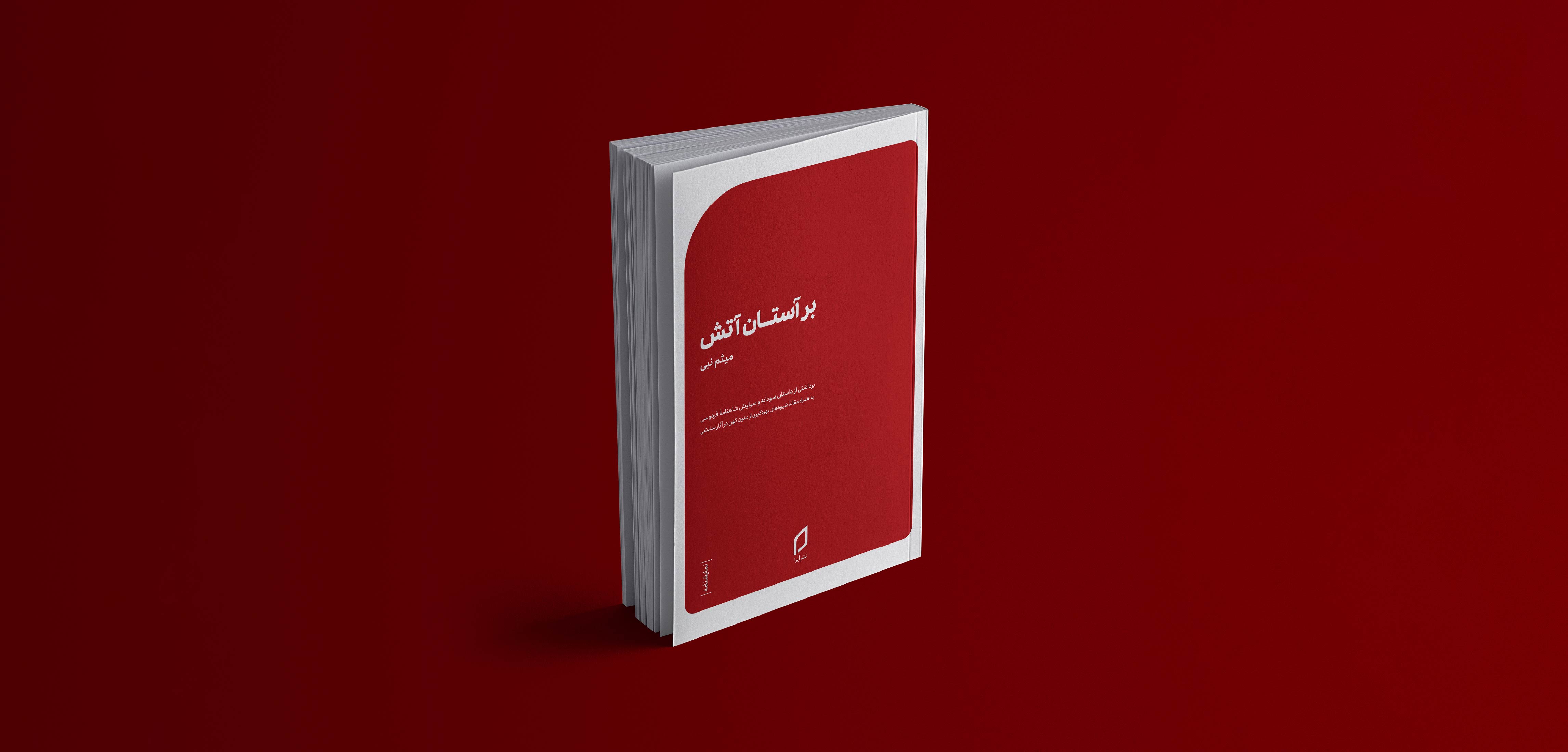

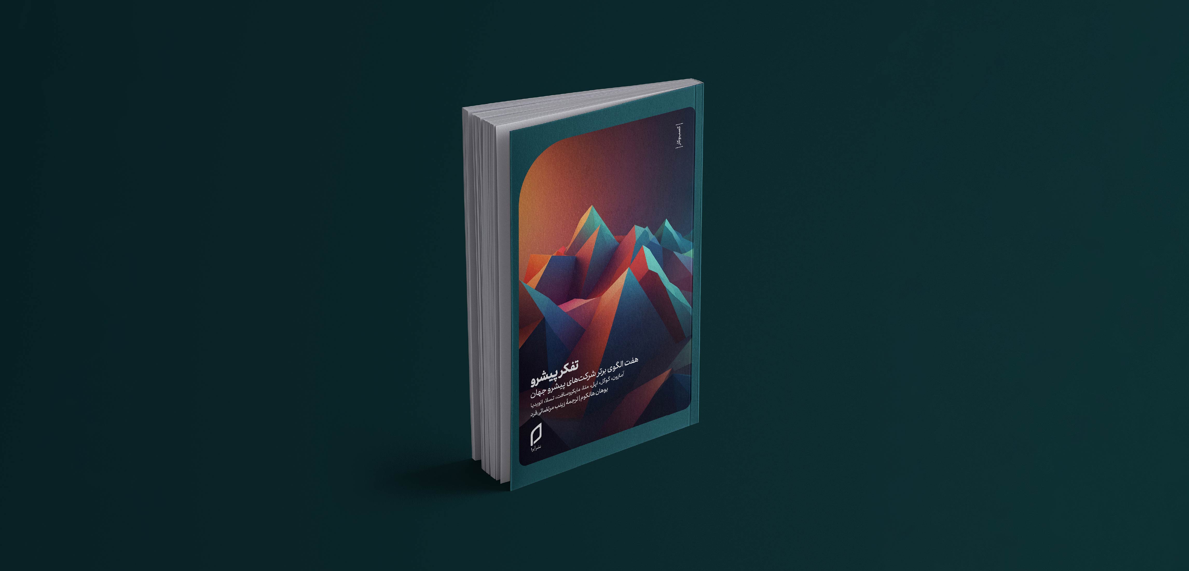
All Ayra covers are built around two consistent elements: the Nian typeface and the rounded frame. Together, these elements create a recognizable visual connection across the publication’s different categories.
While the core elements remain consistent, each category develops its own visual language based on the nature and character of its content.
The visual approach changes according to each category. Personal Development uses minimal and realistic imagery, Business relies on three-dimensional visuals, and On Life follows a more free and realistic photographic approach. Plays use no imagery, relying instead on color and the rounded frame as the primary visual elements.
The layout is not fixed across the collection. Each category follows its own compositional structure, allowing the visual language to adapt to the content while maintaining a cohesive connection to the overall Ayra identity.


This website uses cookies to improve your web experience.