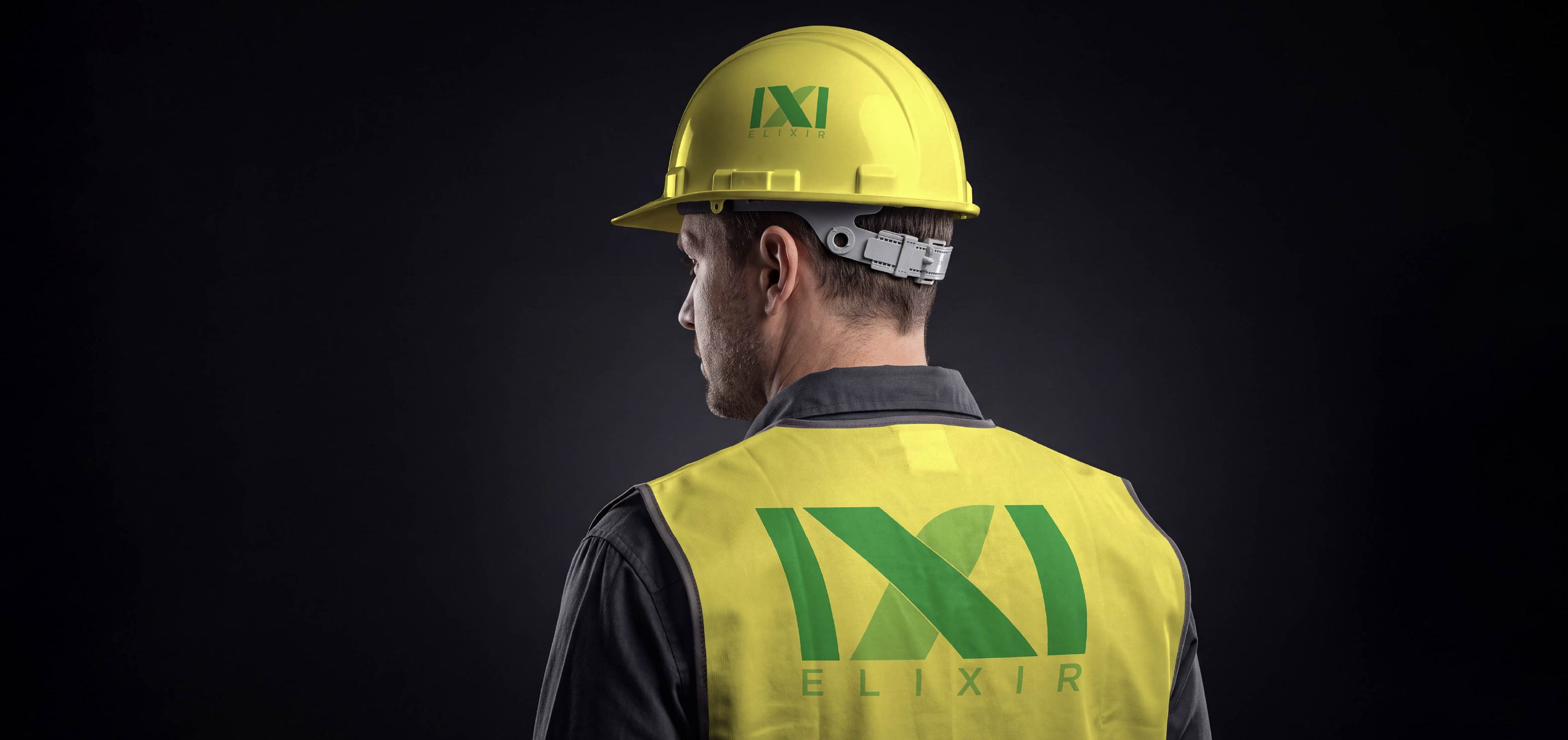

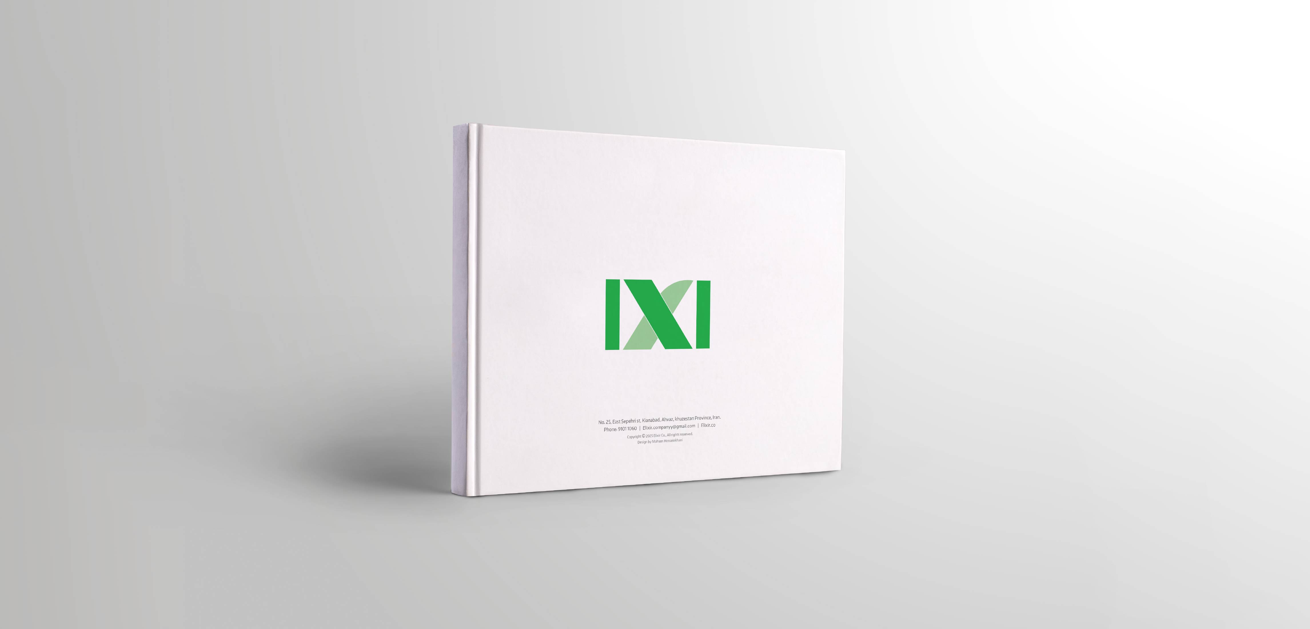
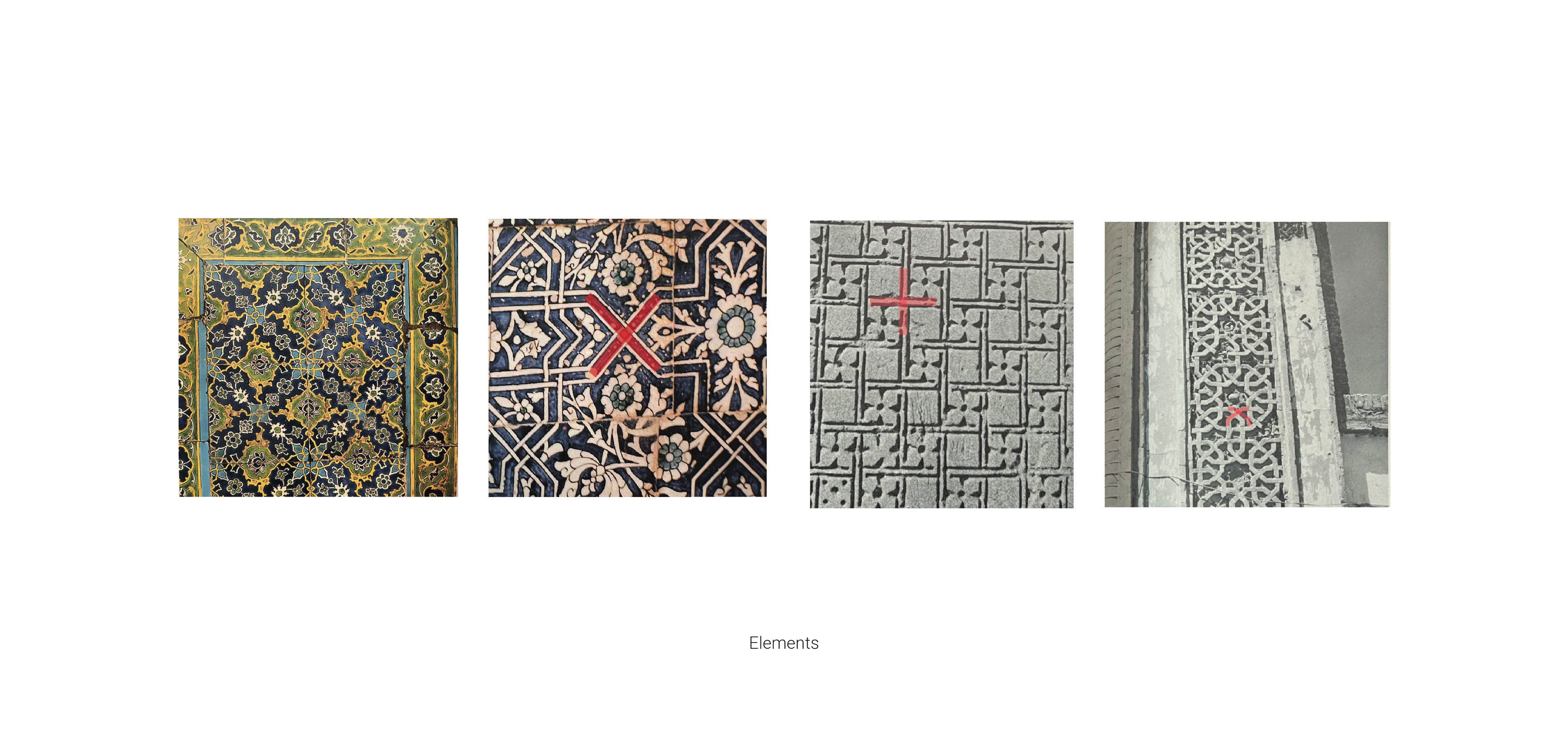
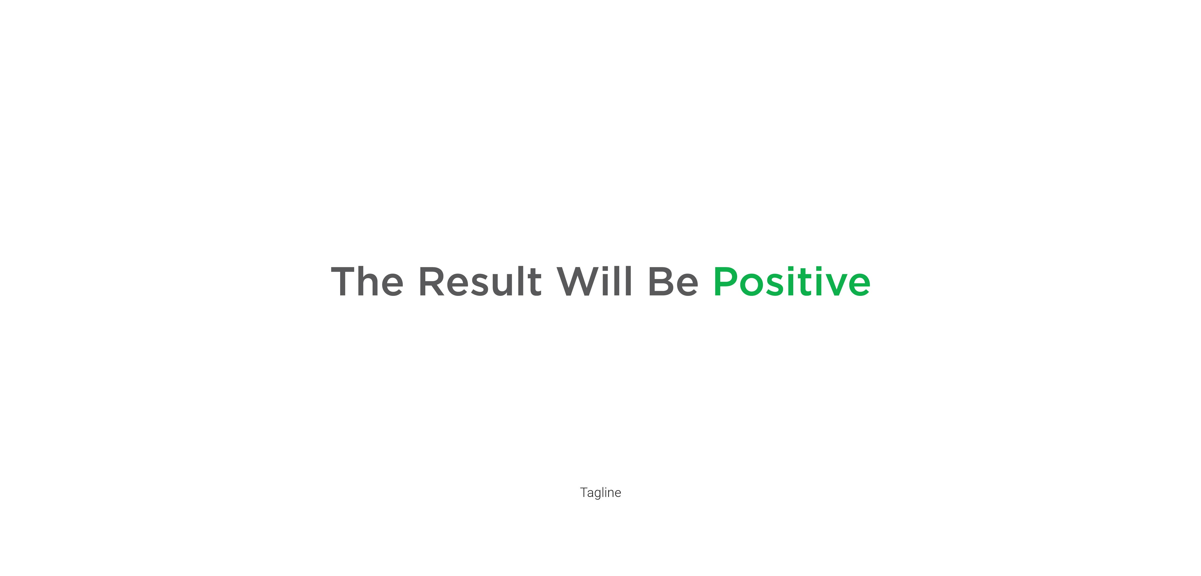
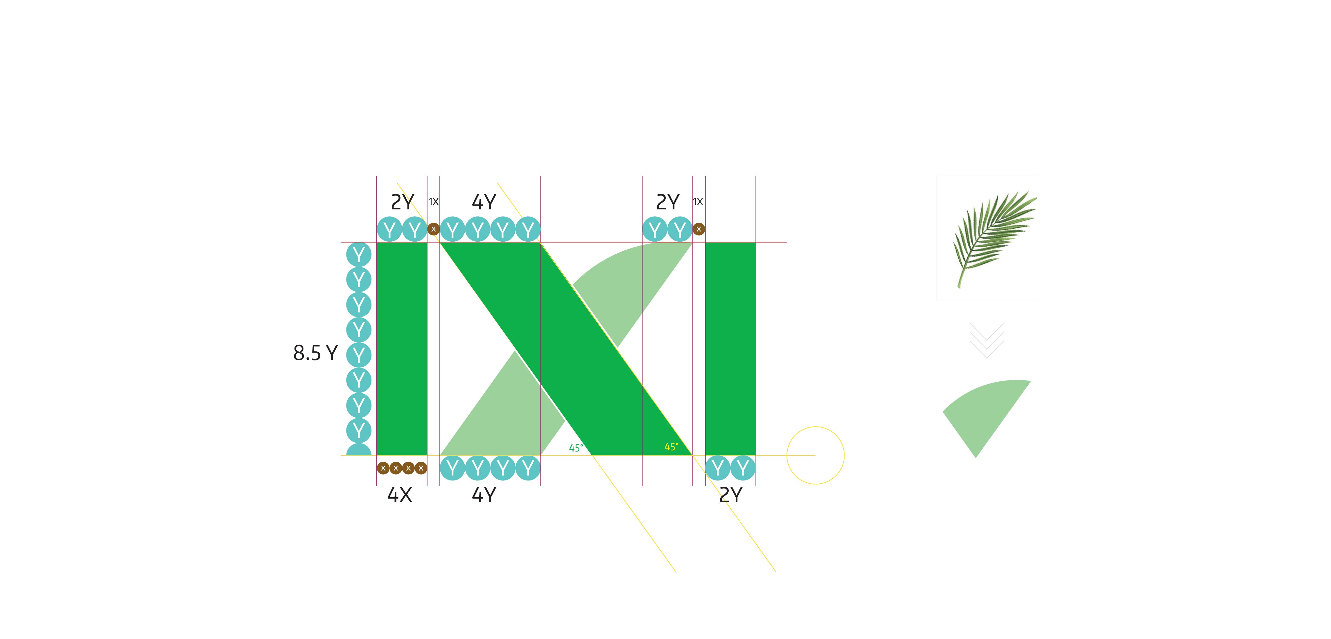
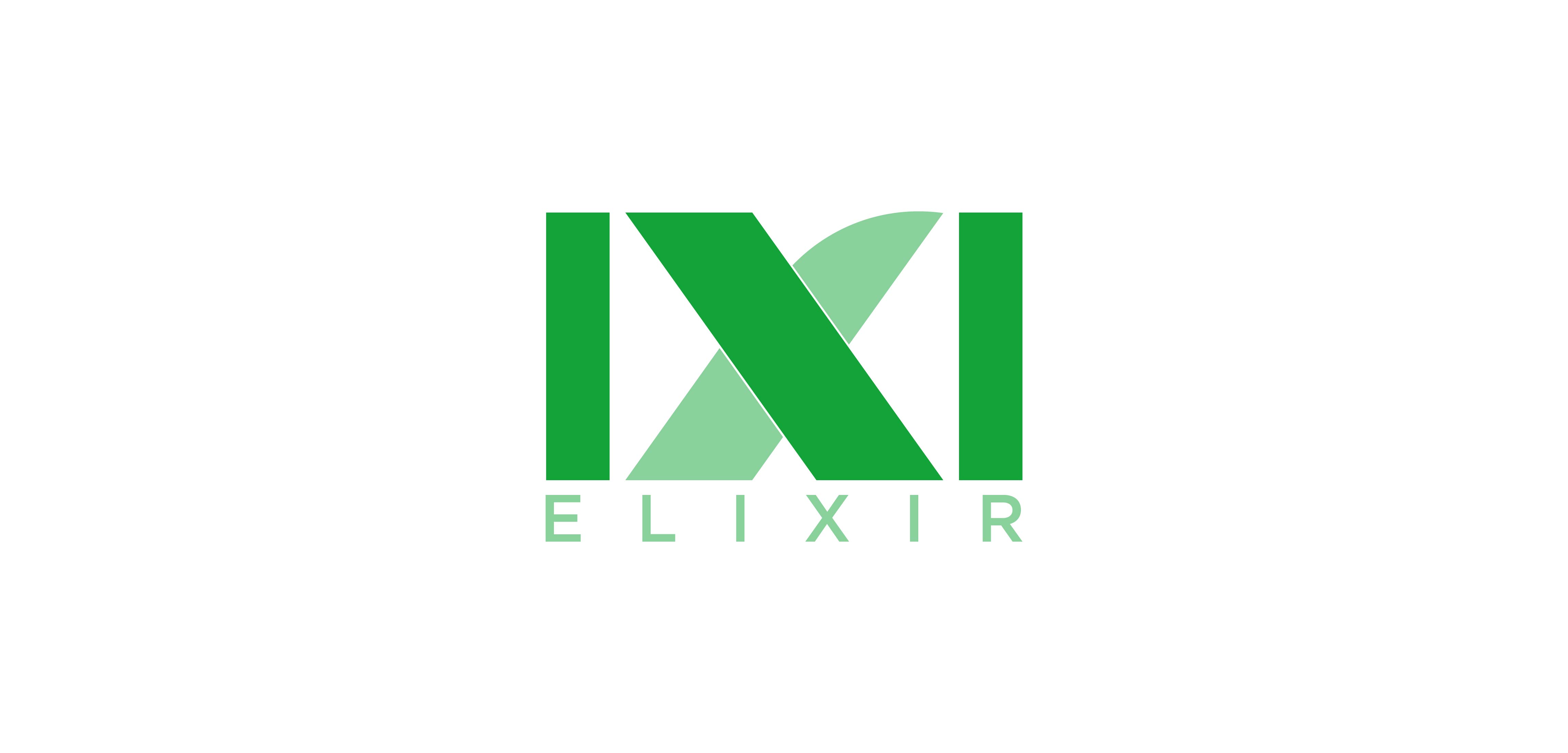
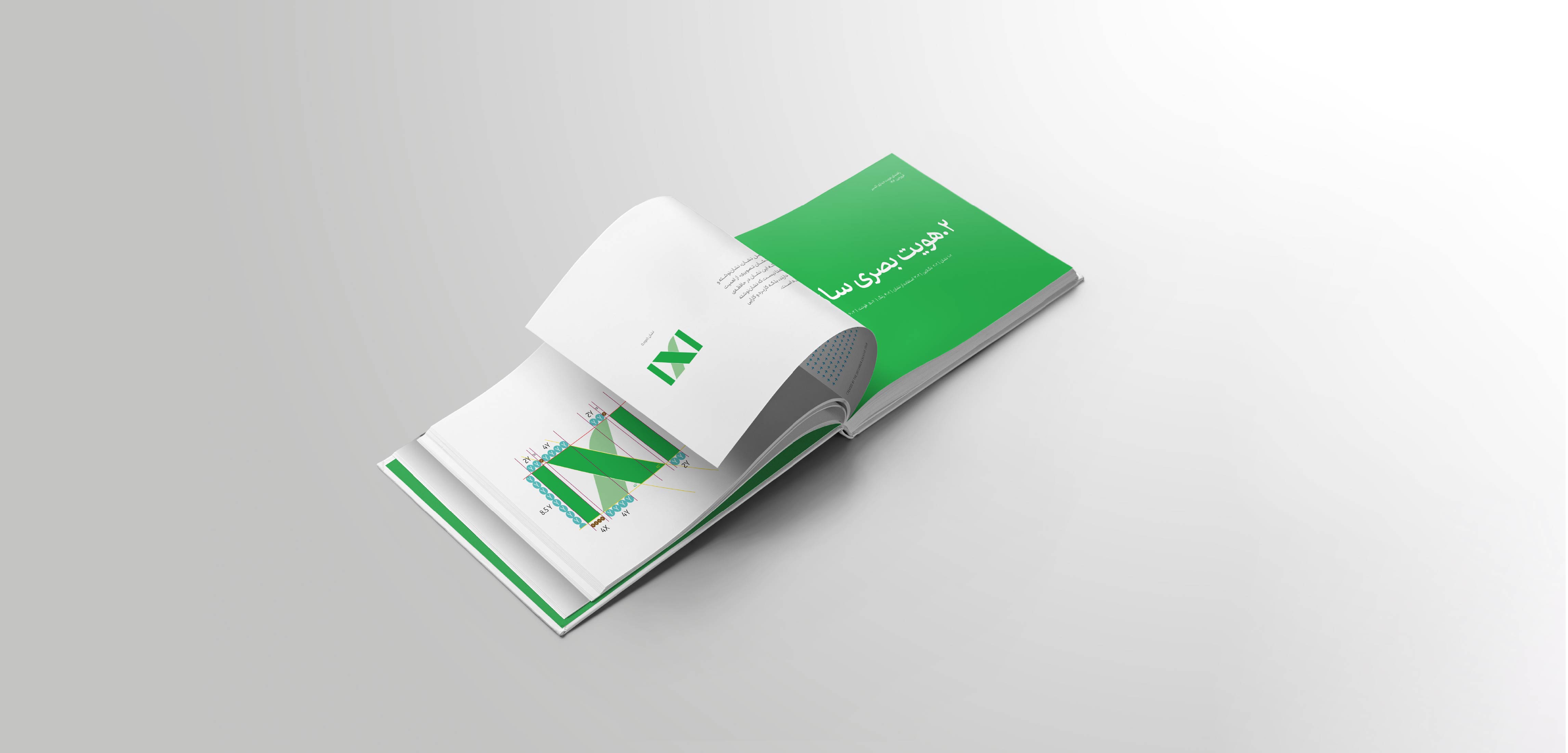
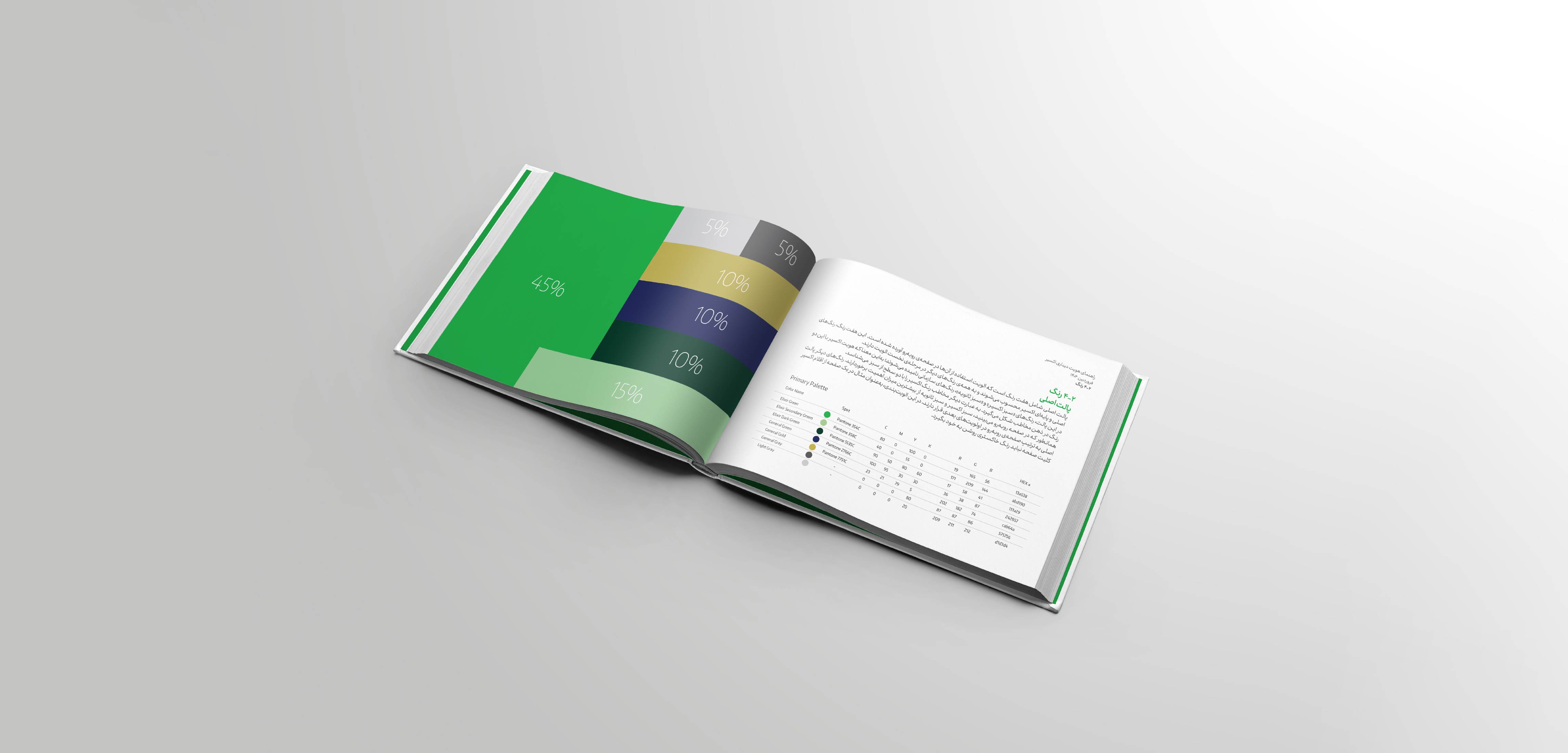
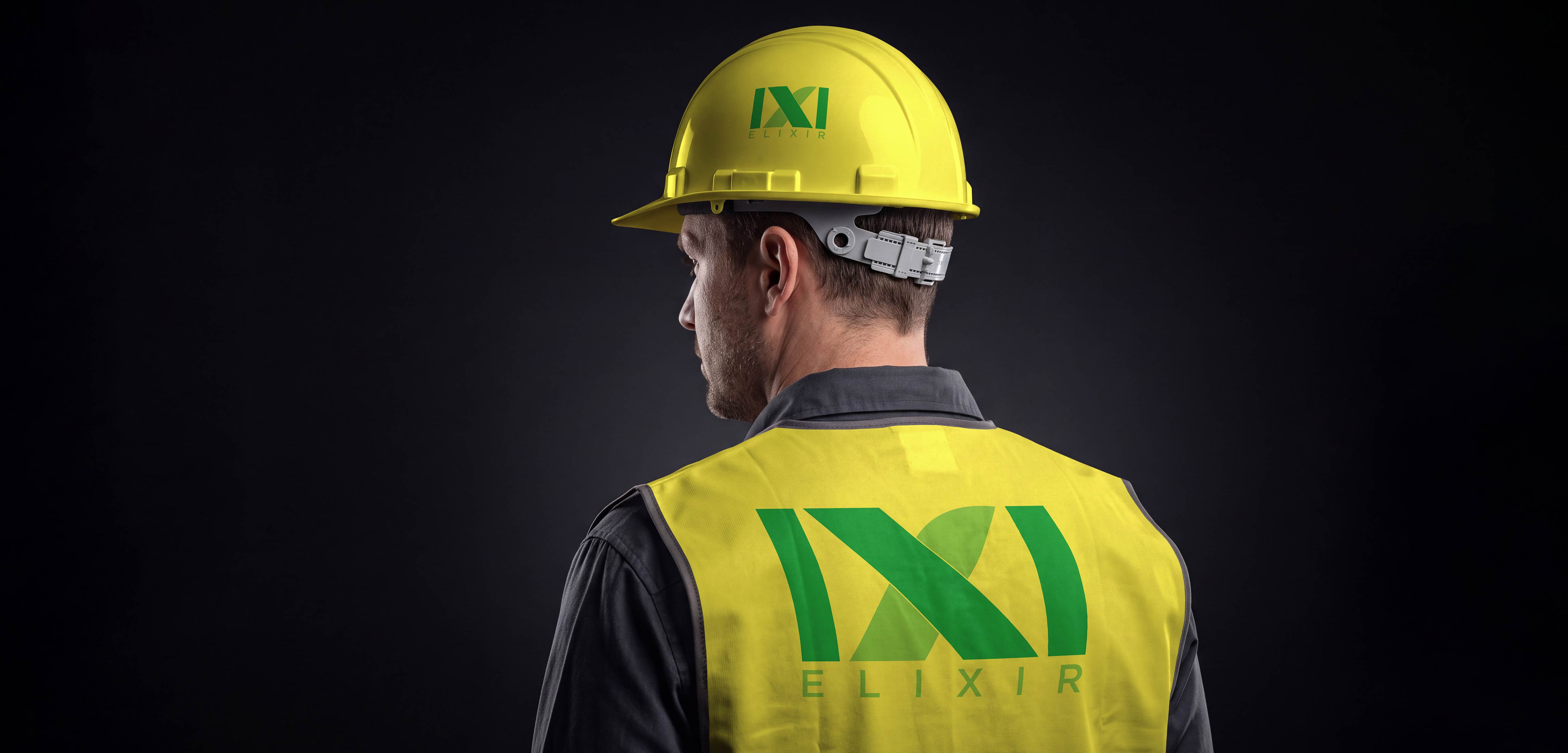
Elixir, a construction and architecture company in southern Iran, commissioned a complete visual identity and brand book. The logo concept evolved from research into local architectural forms and the visual identity of the region, eventually leading to the palm leaf as a distinctive symbol of southern Iran. The concept was further developed through the tagline “The Result Will Be Positive” and the mathematical absolute value symbol, creating a visual relationship between the brand name, the X in ELIXIR, and the idea of a consistently positive result. The final identity combined architectural stability with a strong connection to the region and was delivered as a complete corporate identity and brand book. Elixir Corporate Identity & Brand Book Full Visual Identity Design, Logo, Brand Book Context Elixir, a construction/architecture company operating in southern Iran, approached me after seeing my portfolio in branding and brand writing, requesting a full corporate identity along with a complete brand book. After reviewing the client’s requirements, I found that they wanted a static, powerful logo that would align closely with the concept of their work — architecture and tower construction. Process Given the company’s field of work, I first explored the forms of Iranian historical buildings, looking for a shape that would be visually rich while still relevant to the brand’s identity. I arrived at several good results, but none carried the sense of stability the brief called for. So I changed direction and turned to the palm tree — a form that is common and visually striking throughout southern Iran. The tree itself felt too literal and clichéd as a symbol, so I moved to the palm leaf instead, which had a more distinctive form. While I was developing the logo around the palm leaf form, Reza Morshed, Elixir’s brand manager, raised the point that we also needed to think about a tagline. I stepped back from the logo for a moment, and together we arrived at a strong tagline: «The Result Will Be Positive.» The moment we landed on that line, it sparked an idea — the mathematical absolute value symbol. At the same time, while thinking through how to execute this idea and present the concept of the two absolute-value bars to the client in a more logical way, I noticed that the company’s name, ELIXIR, itself contains an X positioned between two vertical strokes — the two I’s. This became a second supporting fact for the concept. I then curved the corners of the X using the curvature found in the palm leaf form, and everything fell into place: the X now sat inside the absolute value bars, visually and conceptually confirming that the result will, without doubt, be positive. Outcome The result was a logo carrying several layers of meaning at once: the stability required for a construction-industry brand, a form rooted in the natural landscape of southern Iran (the palm), and a clever conceptual interplay between the brand name and its tagline through the mathematical absolute value symbol. The project was delivered to the client as a complete brand book. Logo & Brand Design
Elixir


This website uses cookies to improve your web experience.