
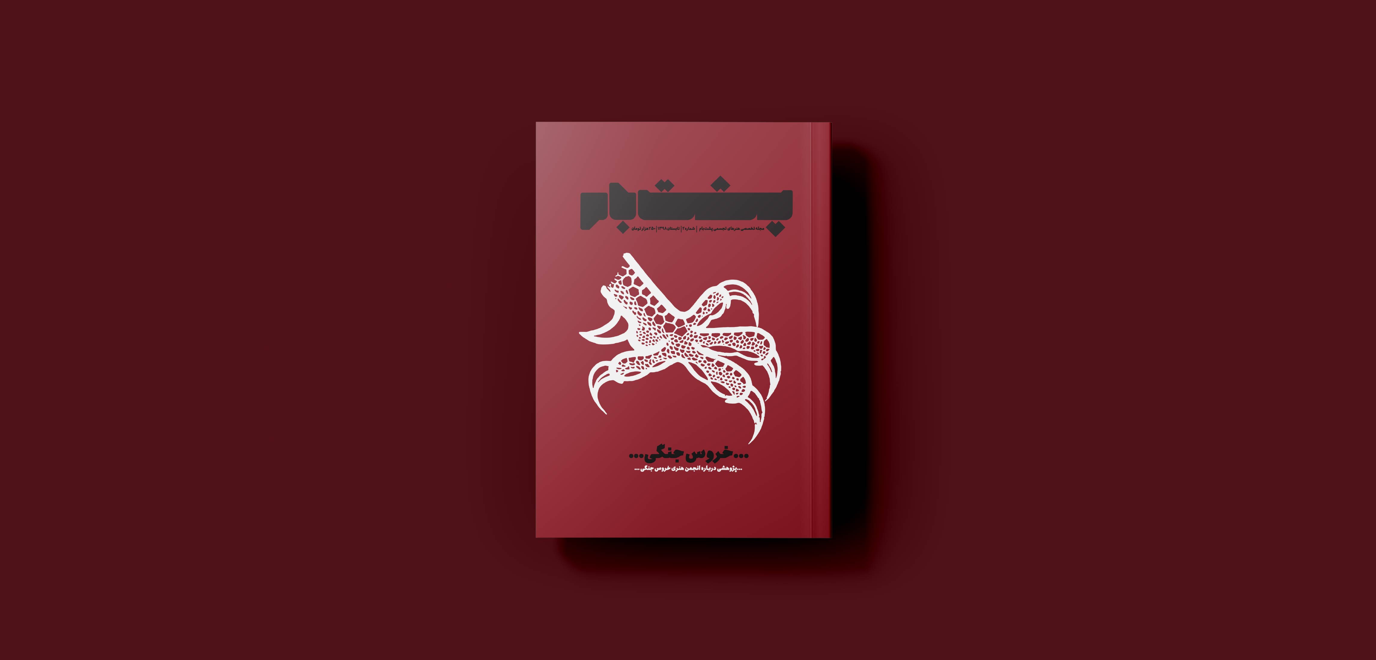
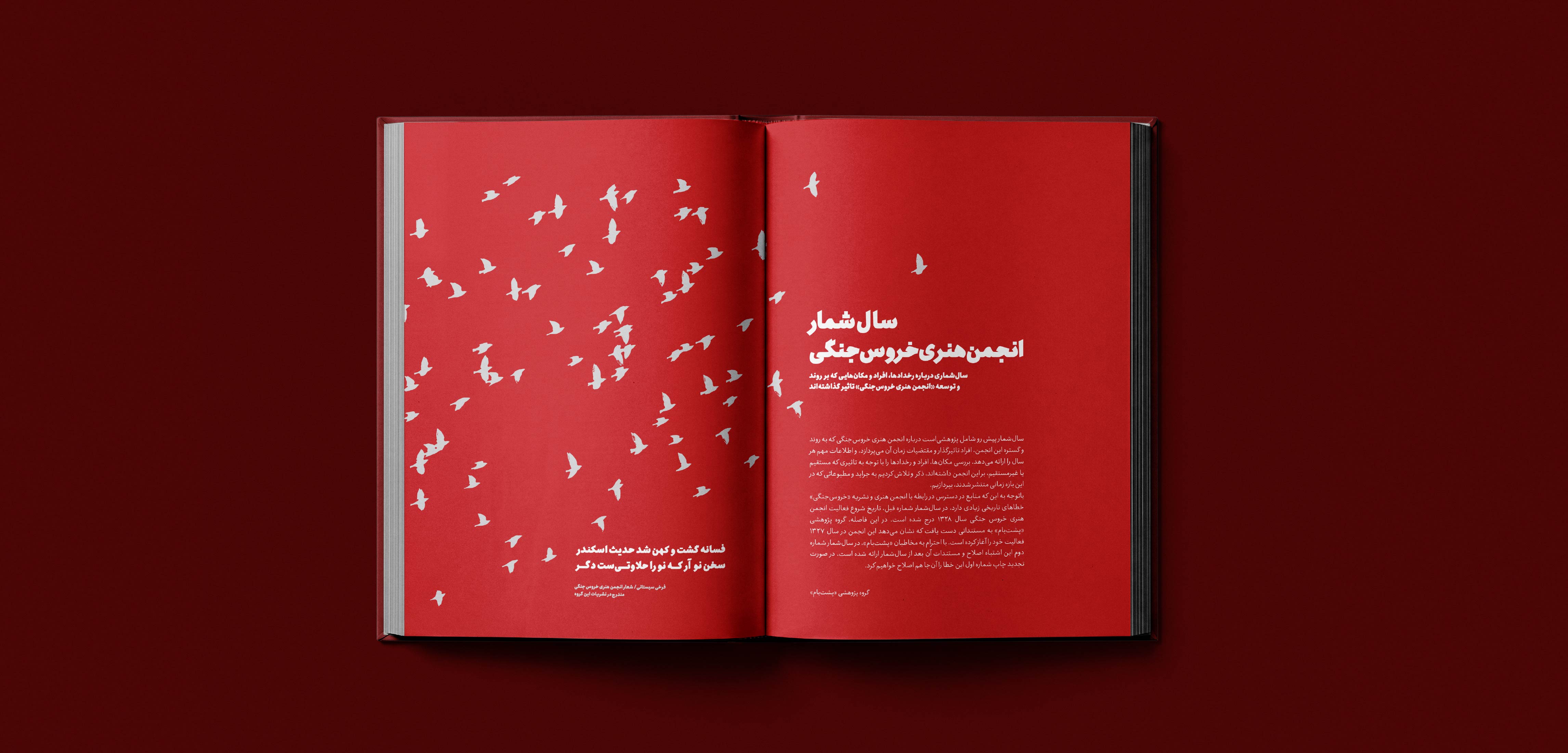
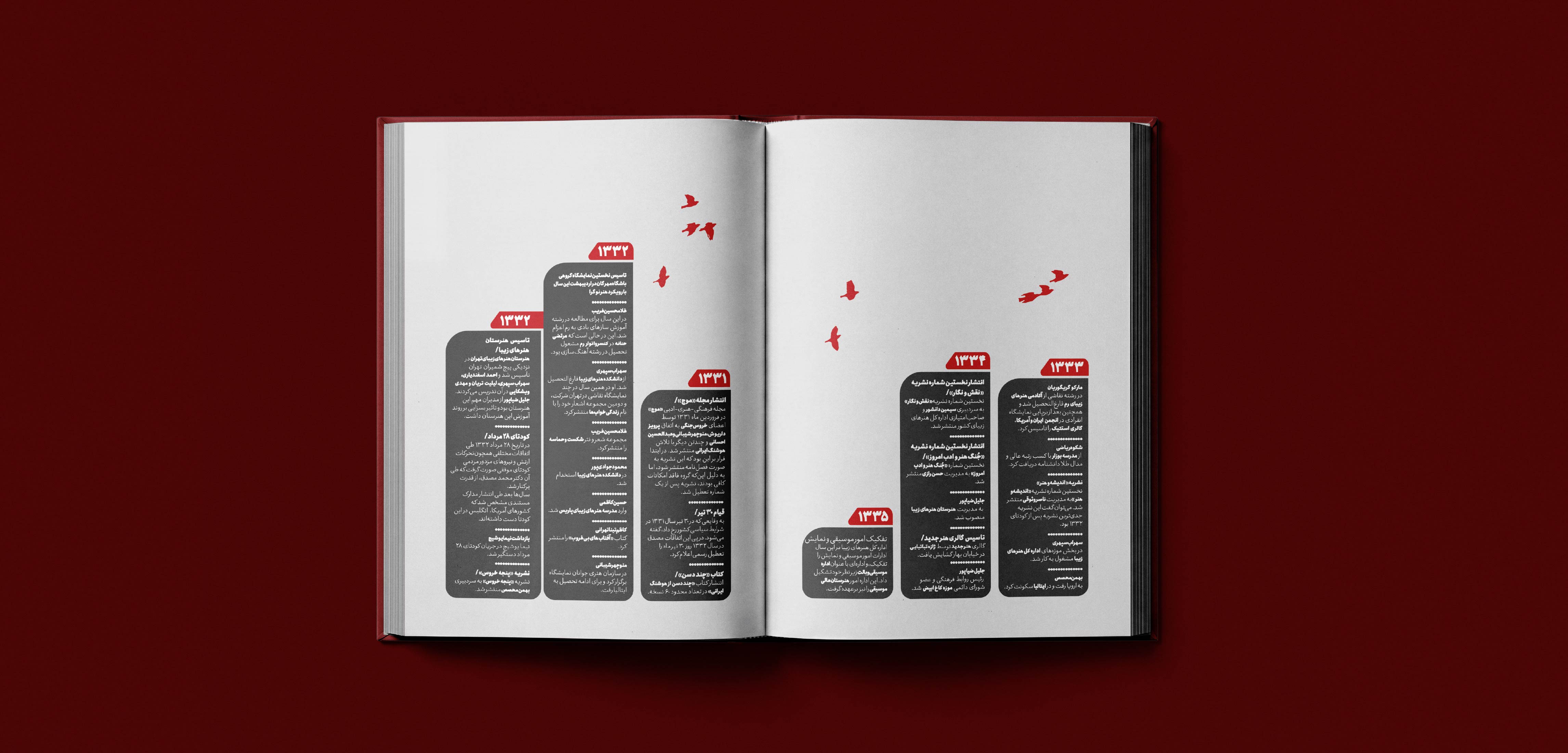
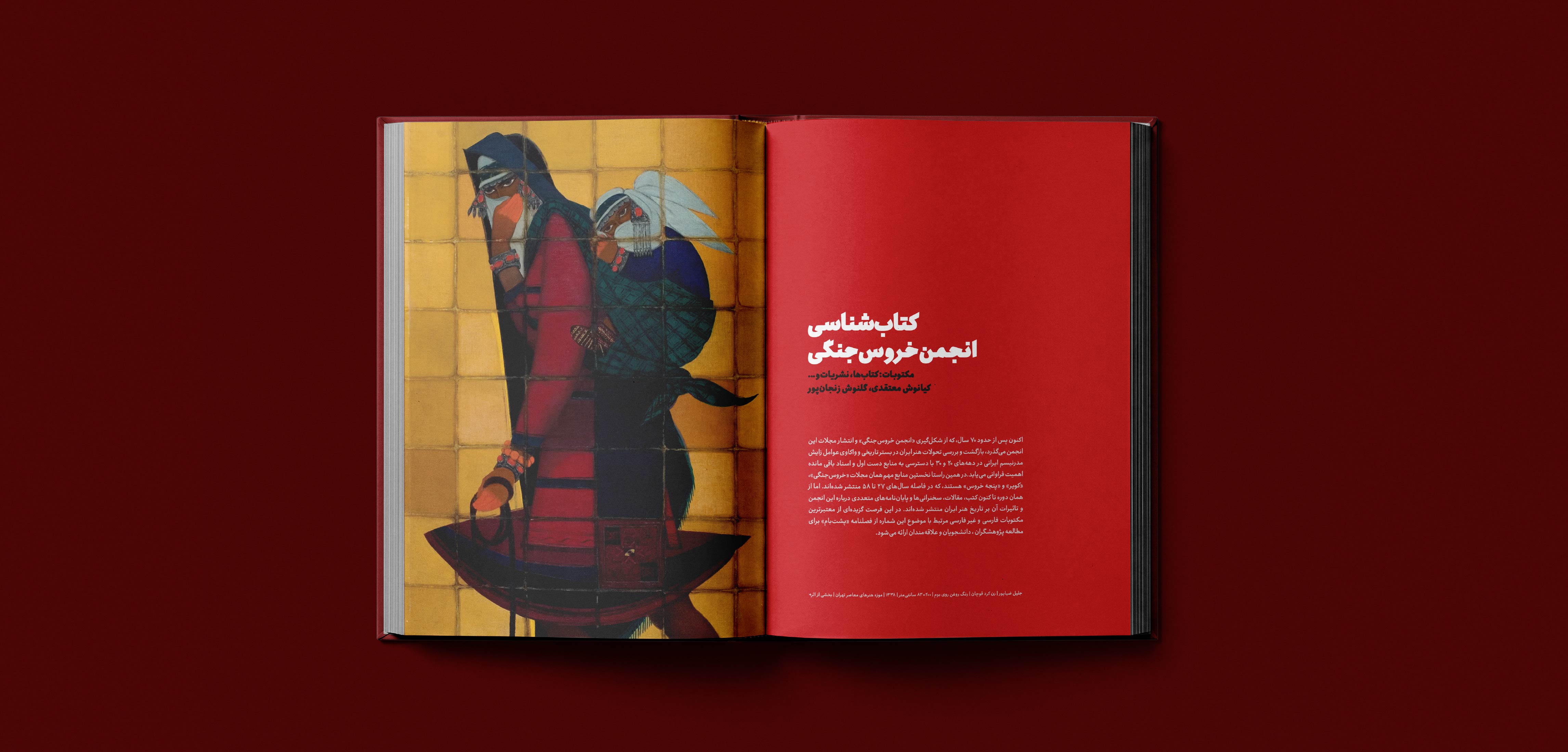
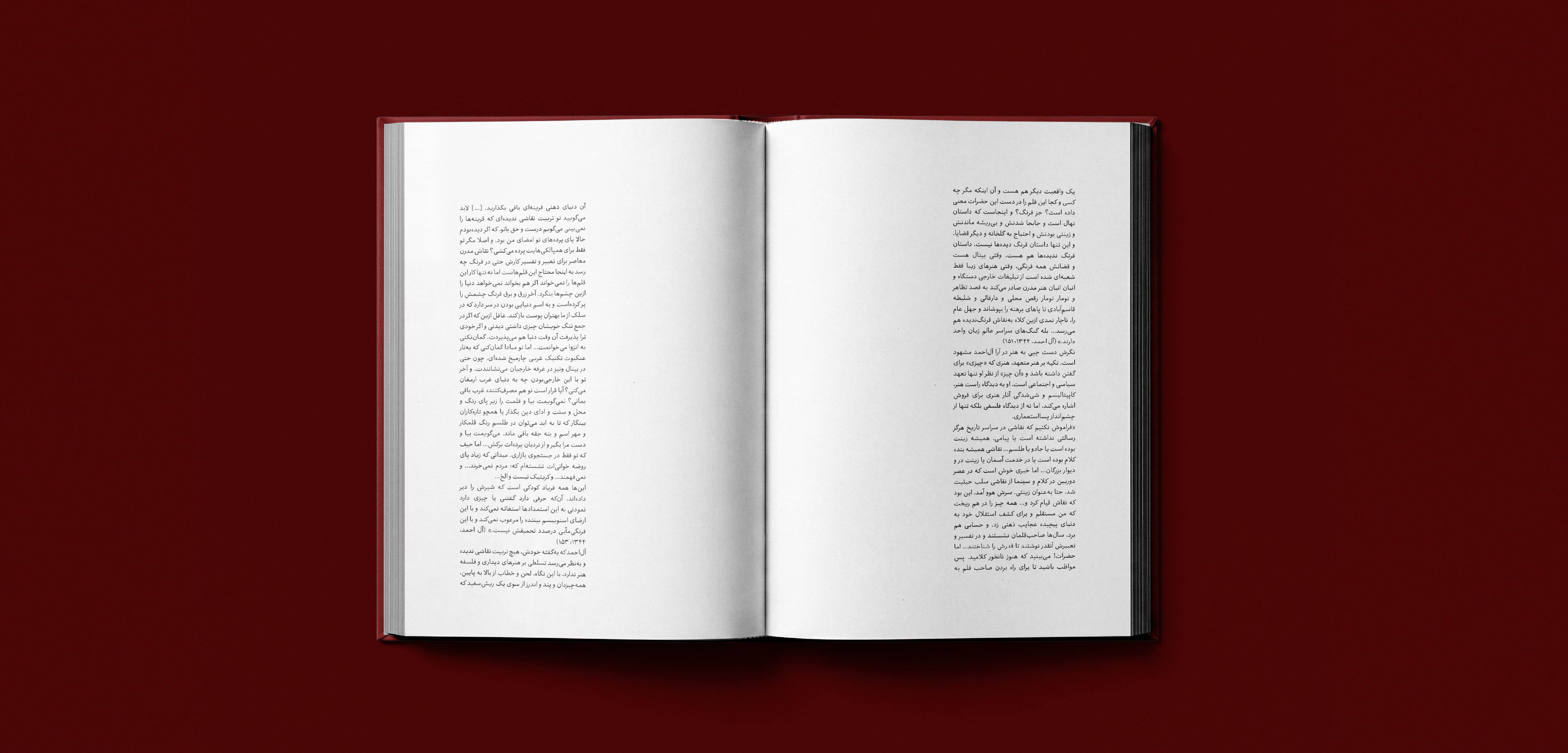
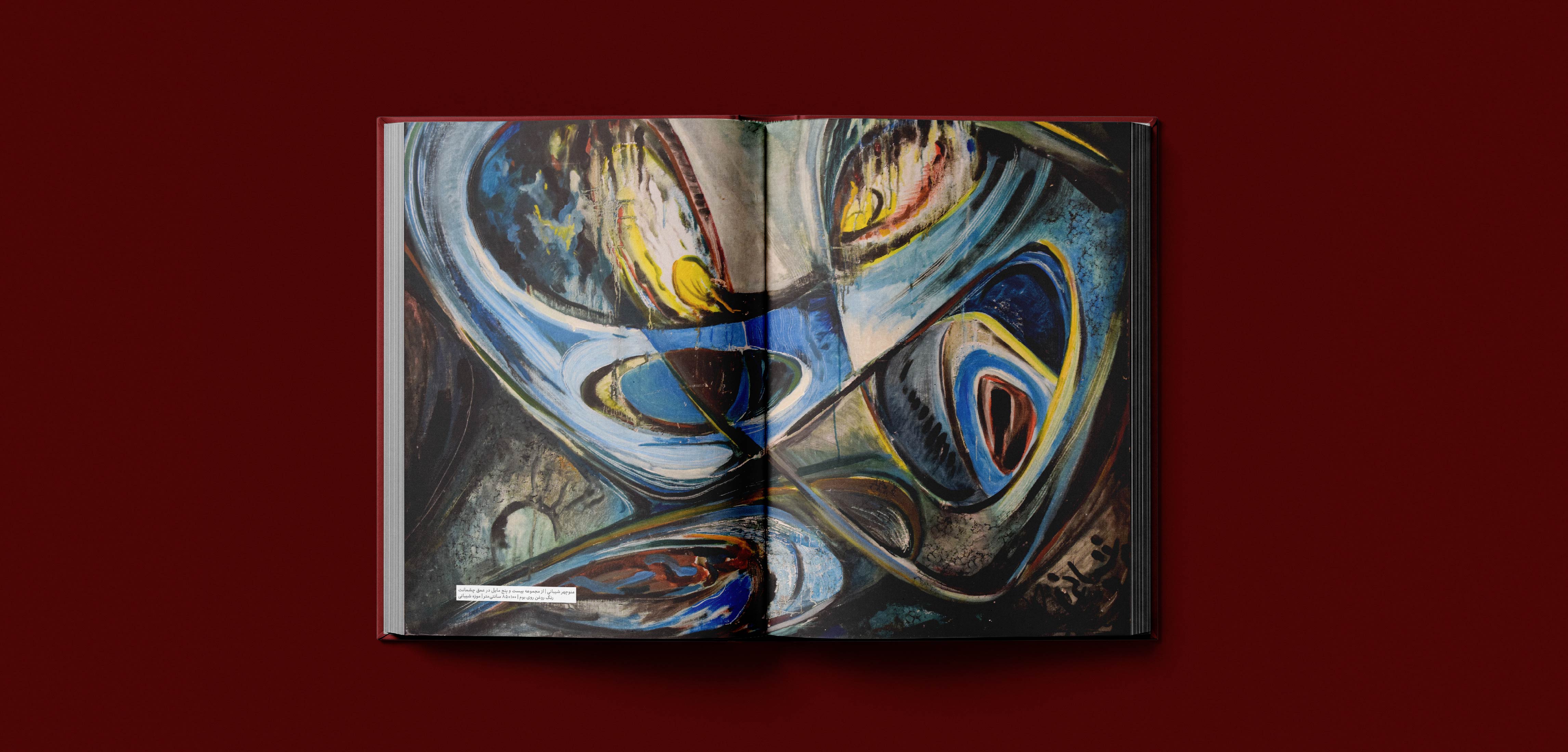
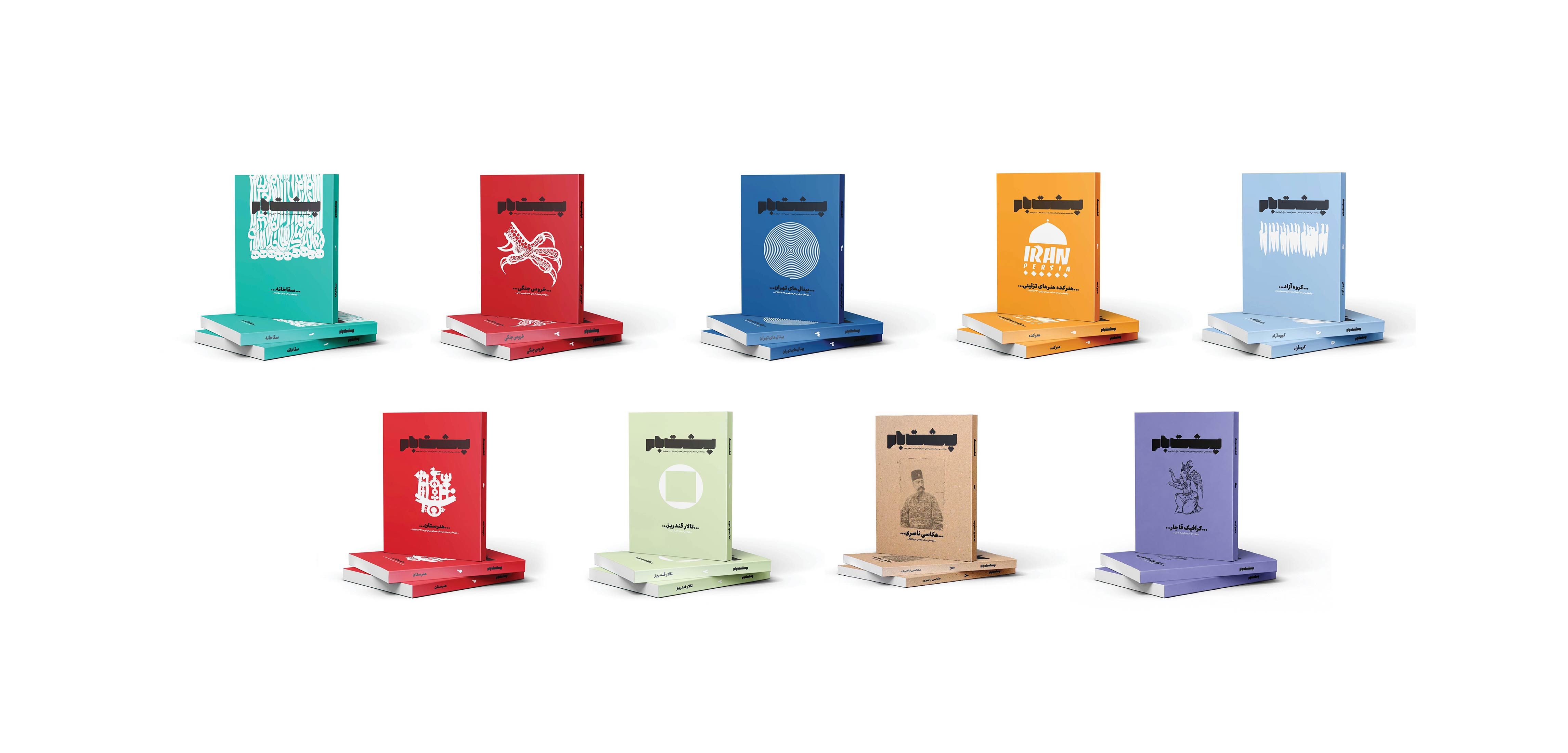
When I began developing the visual language for Poshtebaam, I was not yet its Art Director, but I was responsible for shaping its visual framework. The main challenge was to create a contemporary visual language for both the cover and interior pages without compromising the identity of a specialized publication dedicated to visual arts. Poshtebaam functions more like a research-oriented book than a conventional magazine, with researchers and serious visual arts audiences as its primary readers. The design therefore needed to serve the content—not to compete for attention, but to create focus, readability, and a deeper connection with the material. Based on this approach, a cohesive system for color, typography, composition, and page structure was established, allowing the visual language to remain consistent while adapting across different sections of the publication. Three years later, when I became the Art Director of Poshtebaam, only limited and purposeful refinements were made to the existing system, primarily to further improve the reader’s experience. Cover Design Guidelines 01 — Centered Composition The cover follows a fully centered layout, with all primary elements aligned along the central axis to create a balanced and symmetrical composition. 02 — Issue-Specific Color Each issue is assigned a distinct color identity that defines the visual character of the cover and is carried through the corresponding interior layouts. 03 — Artwork Selection The main visual is selected from the artworks featured within the same issue, creating a direct connection between the cover and the editorial content. 04 — Vector Transformation The selected artwork is transformed into a vector-based graphic before being adapted for the cover, allowing the original artwork to become a flexible graphic element while maintaining its connection to the featured artist. 05 — Cover Typography Roya Bakh is used as the primary typeface for the cover typography, establishing a consistent typographic voice across the cover. Interior Design Guidelines 01 — Color Identity Each issue carries its own distinct color identity throughout the interior layouts, creating visual continuity between different sections of the publication. 02 — Typography System The interior layouts use three styles of the Roya Bakh typeface, providing a consistent typographic system while allowing different levels of hierarchy and emphasis. 03 — Opening Spreads Section openings combine a full-page image with a contrasting color field. High-contrast typography is used on the color field to create a clear visual entry point for major sections. 04 — Reading & Note-taking Layouts Following dense text-heavy sections, selected pages shift to a more open layout. This provides visual relief and reduces reading fatigue while creating additional space for readers to annotate and take notes. 05 — Interview Typography Interview sections use Roya Bakh Semi Bold to distinguish interview content from regular editorial text. The type is set in 80% gray, creating differentiation without excessive visual intensity or distraction. 06 — Reading Layout Long-form content is arranged within controlled text blocks surrounded by generous negative space, creating a calm reading environment and maintaining a consistent visual rhythm. 07 — Information Design Historical and multi-part information is organized into modular information blocks. Variations in block size and height establish hierarchy while creating visual rhythm. 08 — Full-Image Spreads When imagery is the primary content, full-page or full-spread images are used with minimal competing elements, creating visual pauses between information-heavy sections. 09 — Page Numbering Page numbers are positioned at the center of the right-hand page and set in 60% black. Their reduced contrast keeps them functional without competing with the primary editorial content. 10 — Visual Rhythm The publication alternates between text-heavy, image-led, information-driven, and open layouts rather than relying on a single rigid template. This controlled variation maintains visual engagement throughout the reading experience. 11 — Consistent Graphic Language Recurring graphic elements, markers, labels, and visual motifs follow a consistent design logic and adapt to the color identity of each issue, maintaining cohesion across different sections. Art Direction
Poshtebaam Art Magazine


This website uses cookies to improve your web experience.