
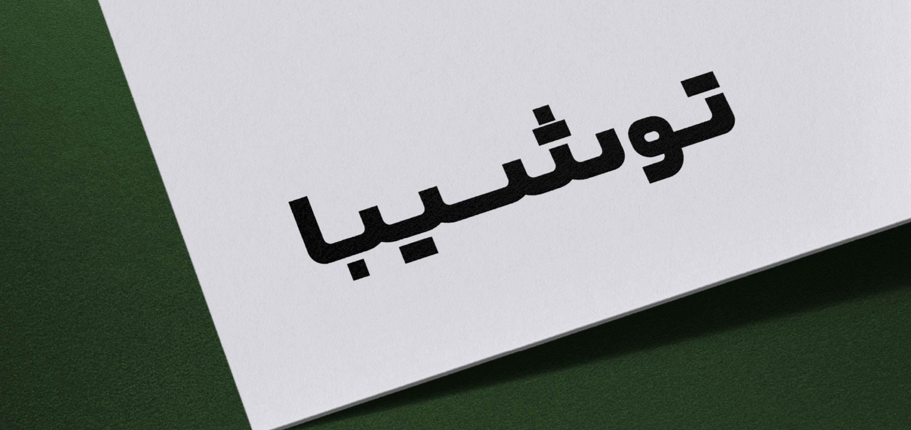

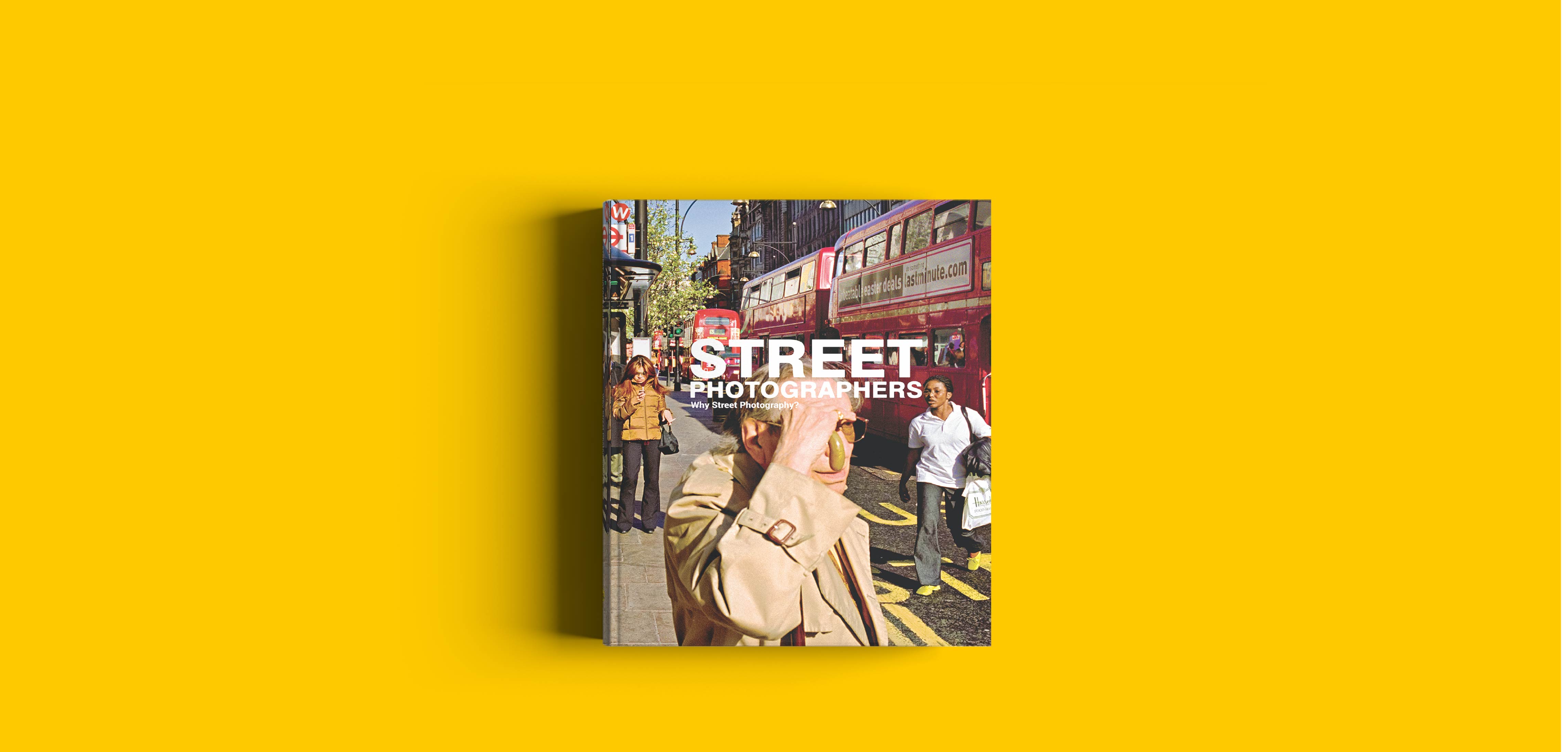
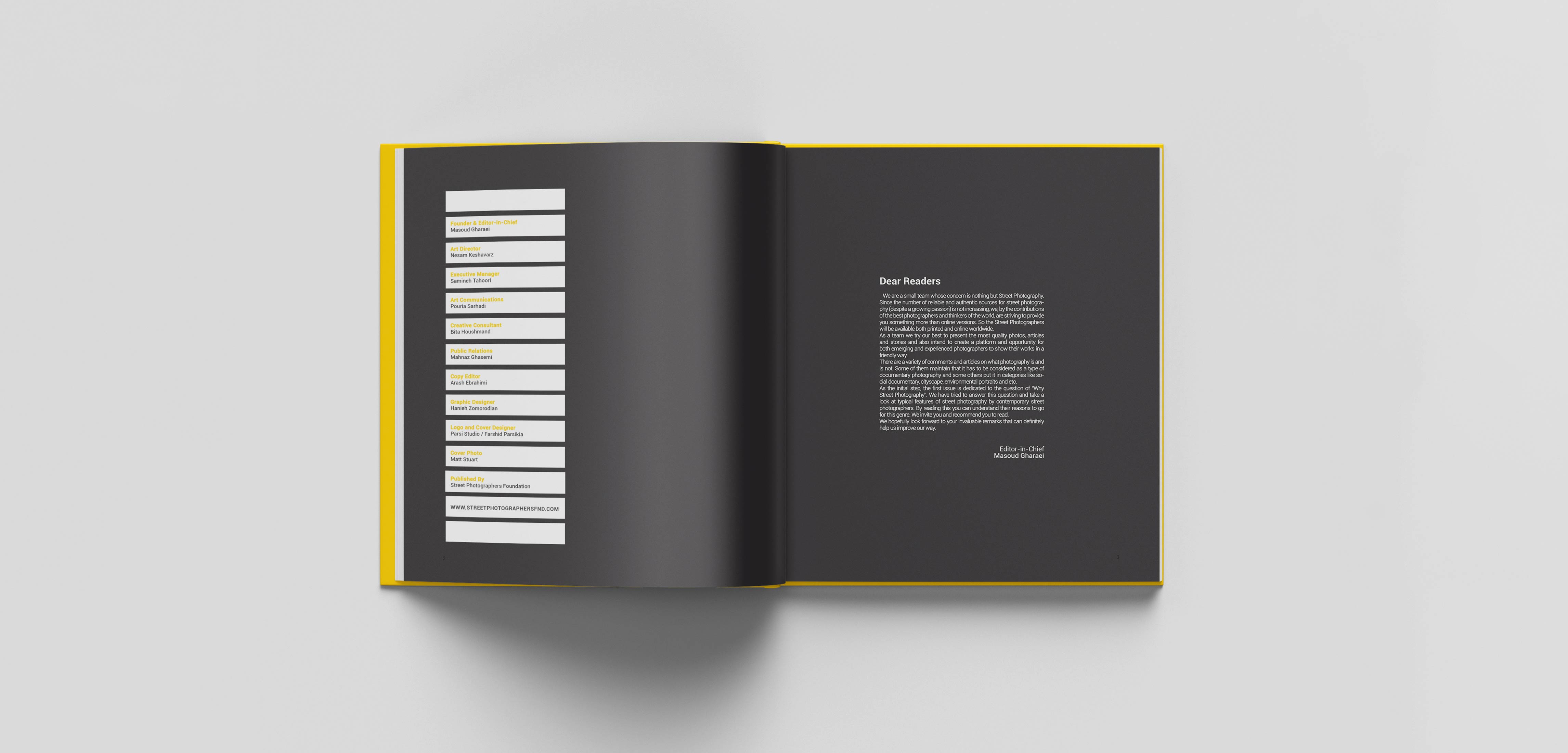
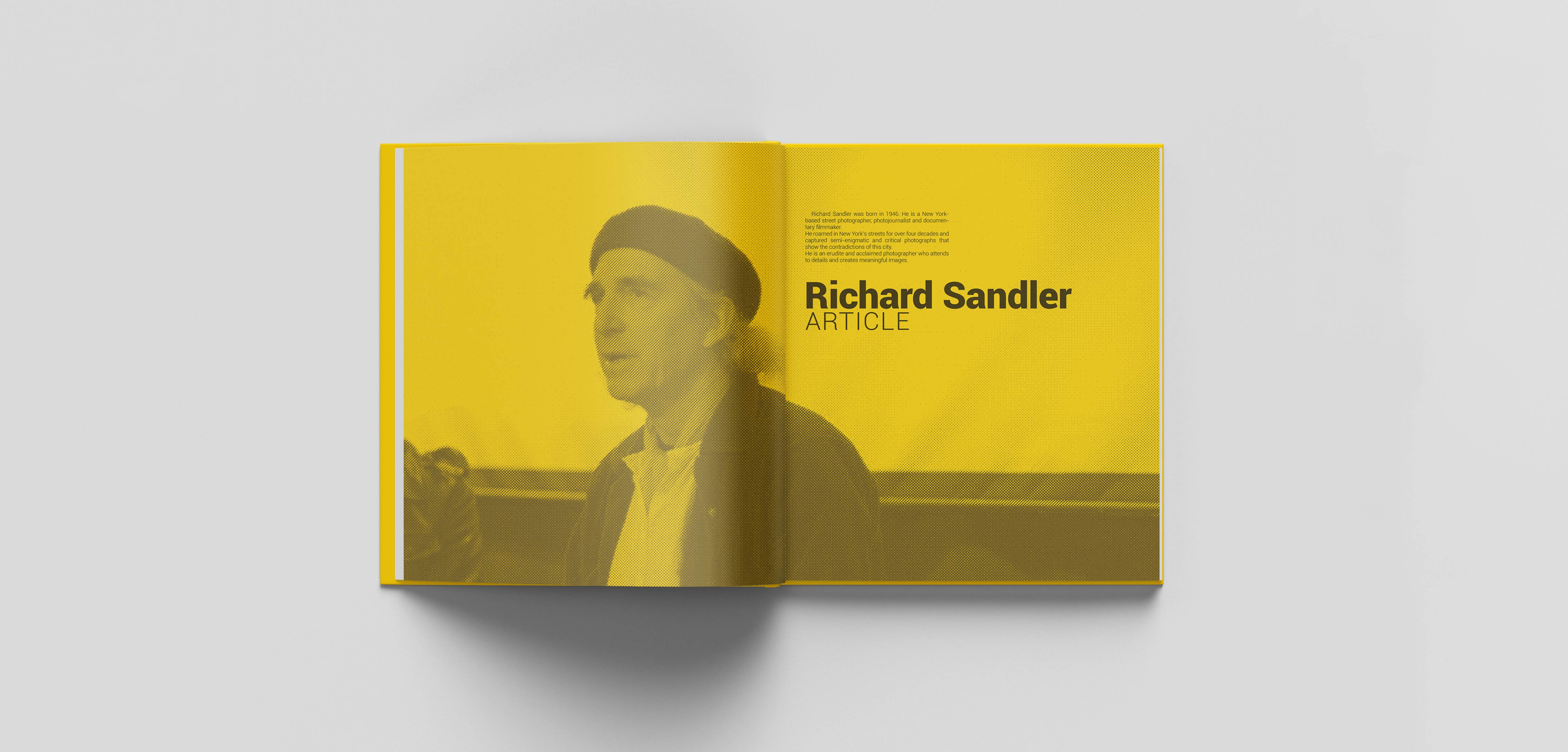
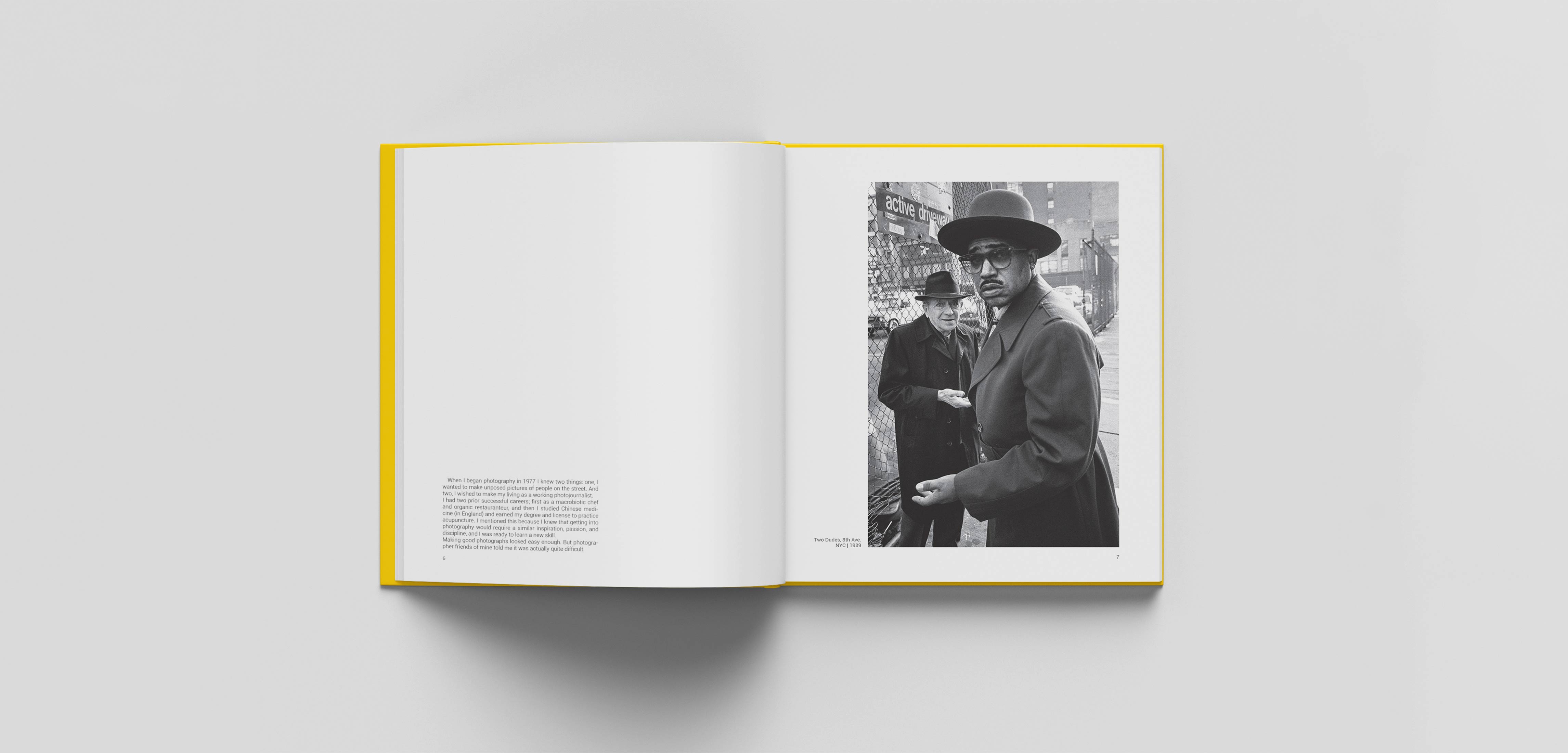
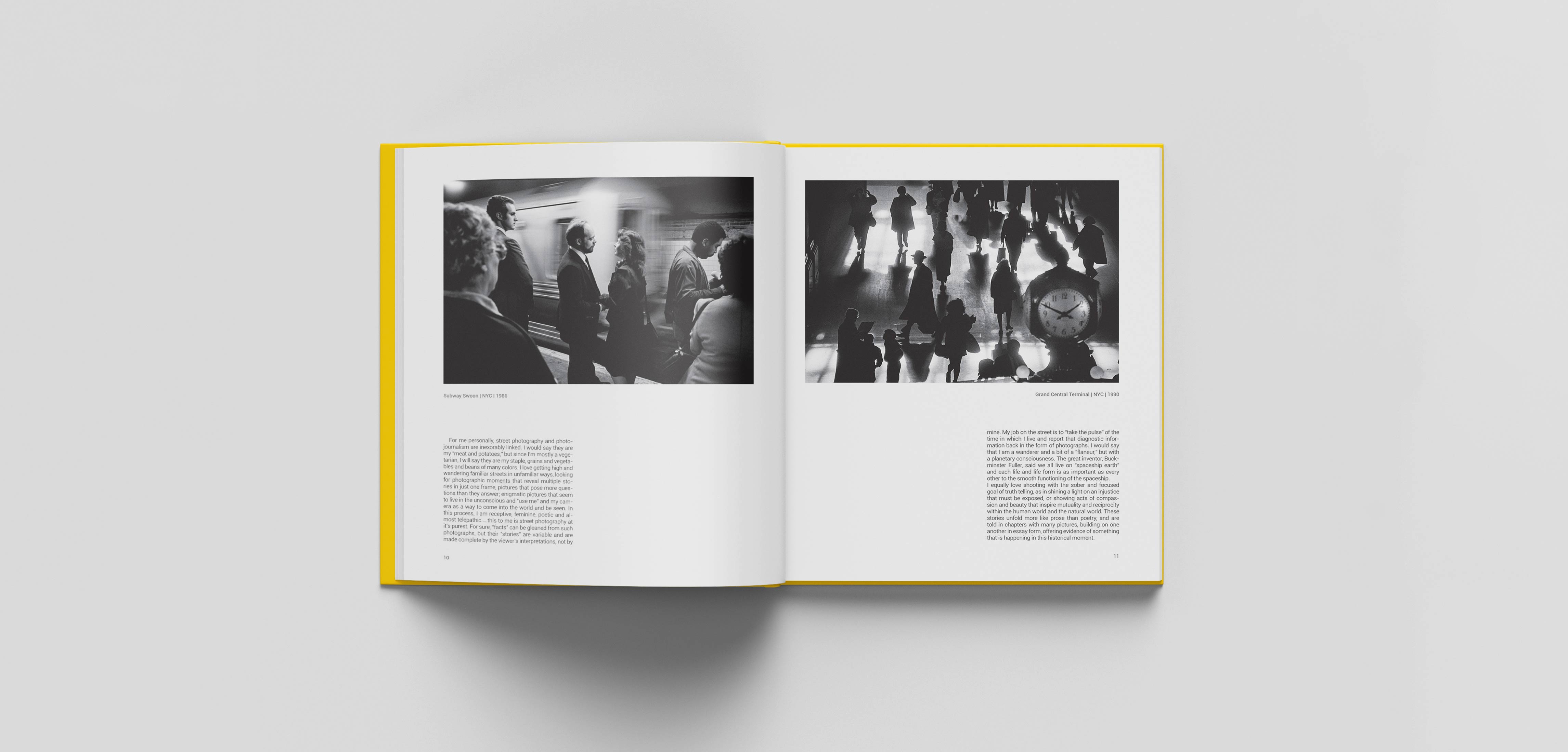
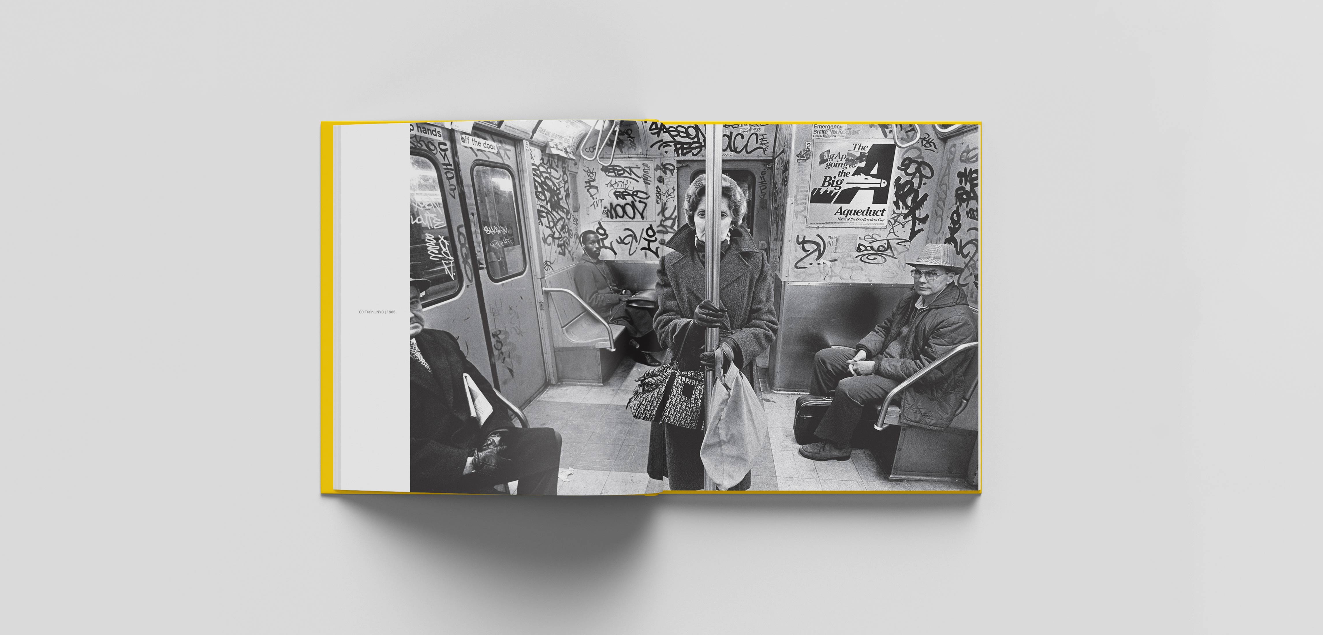
Why Street Photography? came to us with a layout that didn’t quite reflect what the client was looking for, so we decided to rethink the book from the ground up. For the first Street Photographers publication, I wanted the design to give the photographs room to speak. I was drawn to the principles of Swiss graphic design — a structured grid, strong typography, and generous negative space — as a way to create a quiet framework around the images rather than compete with them. After several initial experiments, the direction started to feel right. I redesigned a section of the book and presented it to the client, and the response confirmed that we were on the right track. This project remains one of the works I’m particularly fond of — a simple idea that found its strength in giving the photography space to breathe. why Did the persian Toshiba Logotype Need to Be Redesignerd? A review of the Persian versions of the Toshiba logo that had been used in Iran over the years revealed that they did not follow a consistent structure or defined set of guidelines. When placed alongside the English logo, they also lacked sufficient visual coherence. In some cases, the Persian and English versions appeared less like parts of a unified identity system and more like two independent forms. During the development of the new Persian logotype, the previous versions were also studied. Since these forms were already familiar to Iranian audiences, some of the initial explorations were based on revisiting and refining the existing logotypes. This approach offered an opportunity to preserve part of the visual memory that had developed around the brand. However, it became clear that this solution still could not establish a strong enough connection between the Persian and English versions. At the same time, the new logotype needed to work alongside the English version across a wide range of applications and scales—from environmental communications and advertising to digital media and printed materials. For this reason, the design process did not focus solely on achieving a visual resemblance between the two versions. Proportions, visual weight, and the reproducibility of the Persian logotype were also carefully considered throughout the process. Layout Design
Why Street Photography?


This website uses cookies to improve your web experience.